Private Leigh Whiting This portfolio is password protected. Enter the password to continue.
Incorrect password

Make it undeniable.

Design and strategy direction for complex, high-stakes subjects: urban policy, infrastructure finance, deep technology. Mostly for people trying to make daily life better, safer or more sustainable.

I have led design teams at Google companies, designed books taught at Harvard, and helped launch America's first autonomous lane.

Based between LondonNew YorkSan Francisco
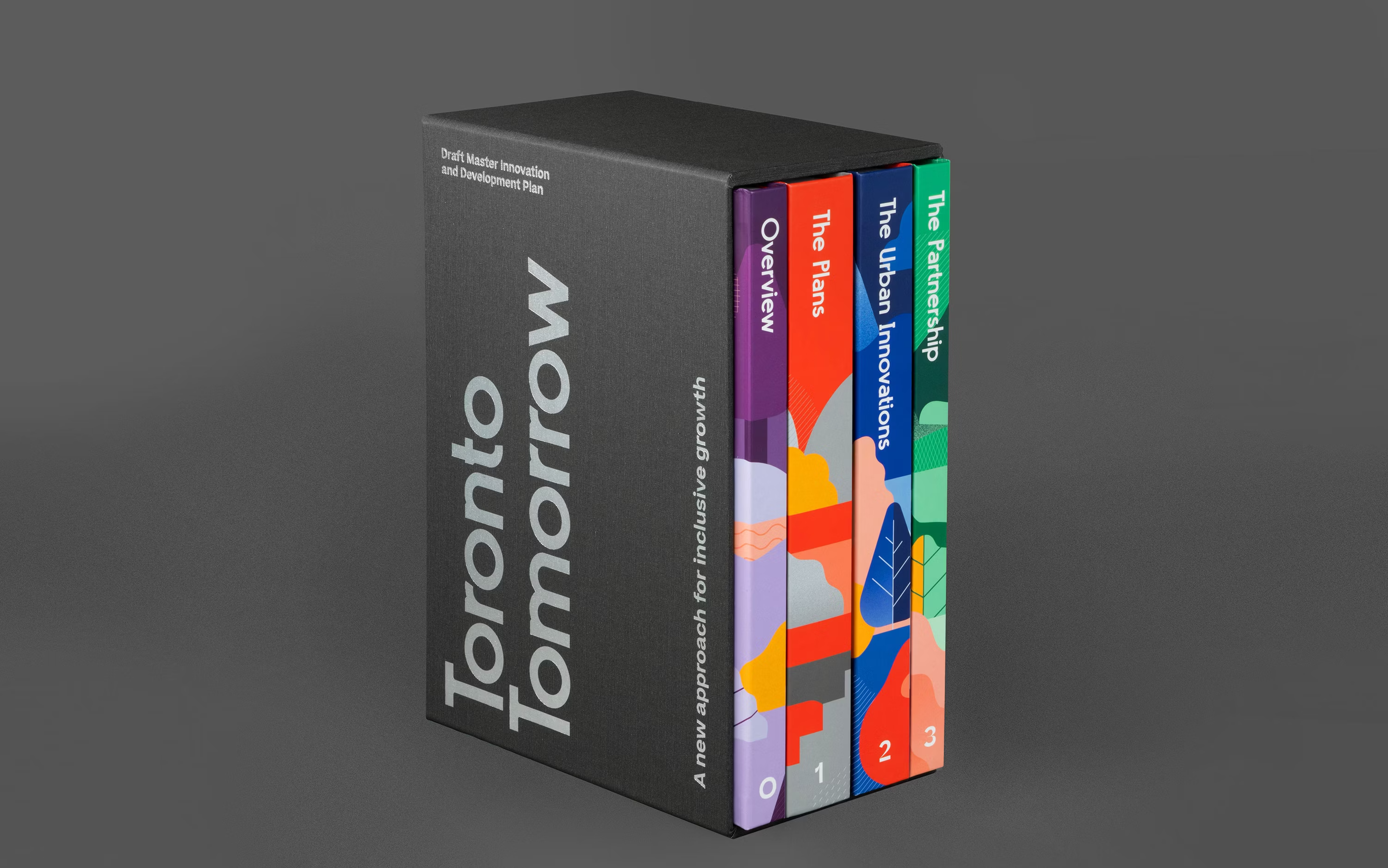
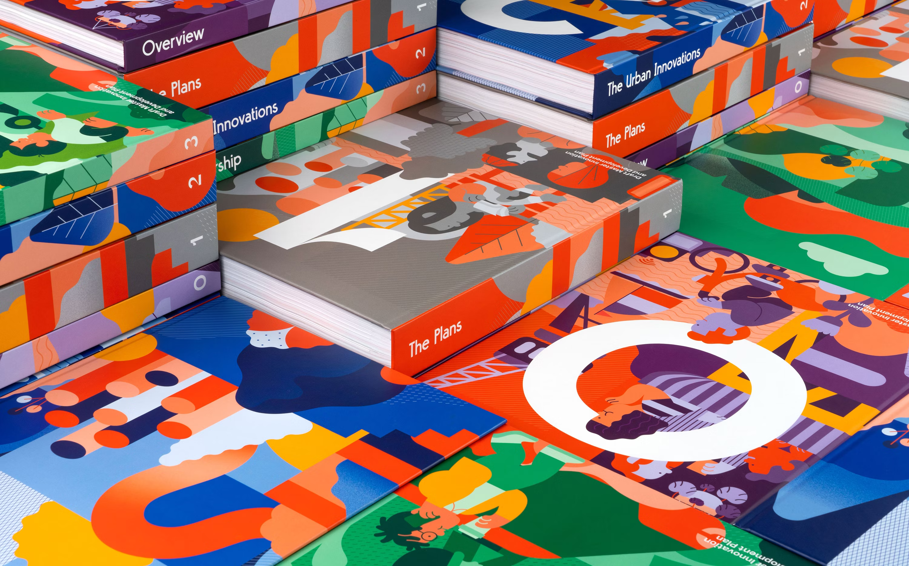
Toronto Tomorrow Sidewalk Labs • Google / Publication system Swipe to preview 2019
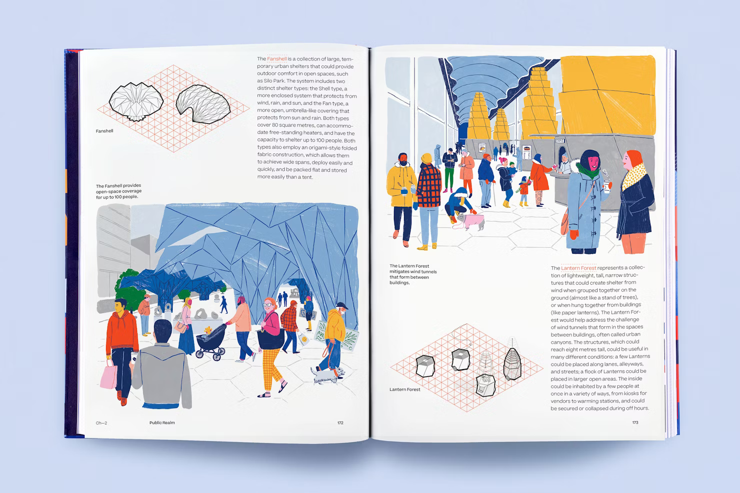
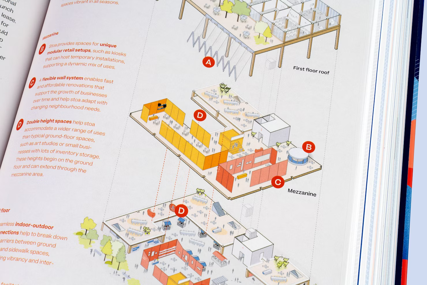
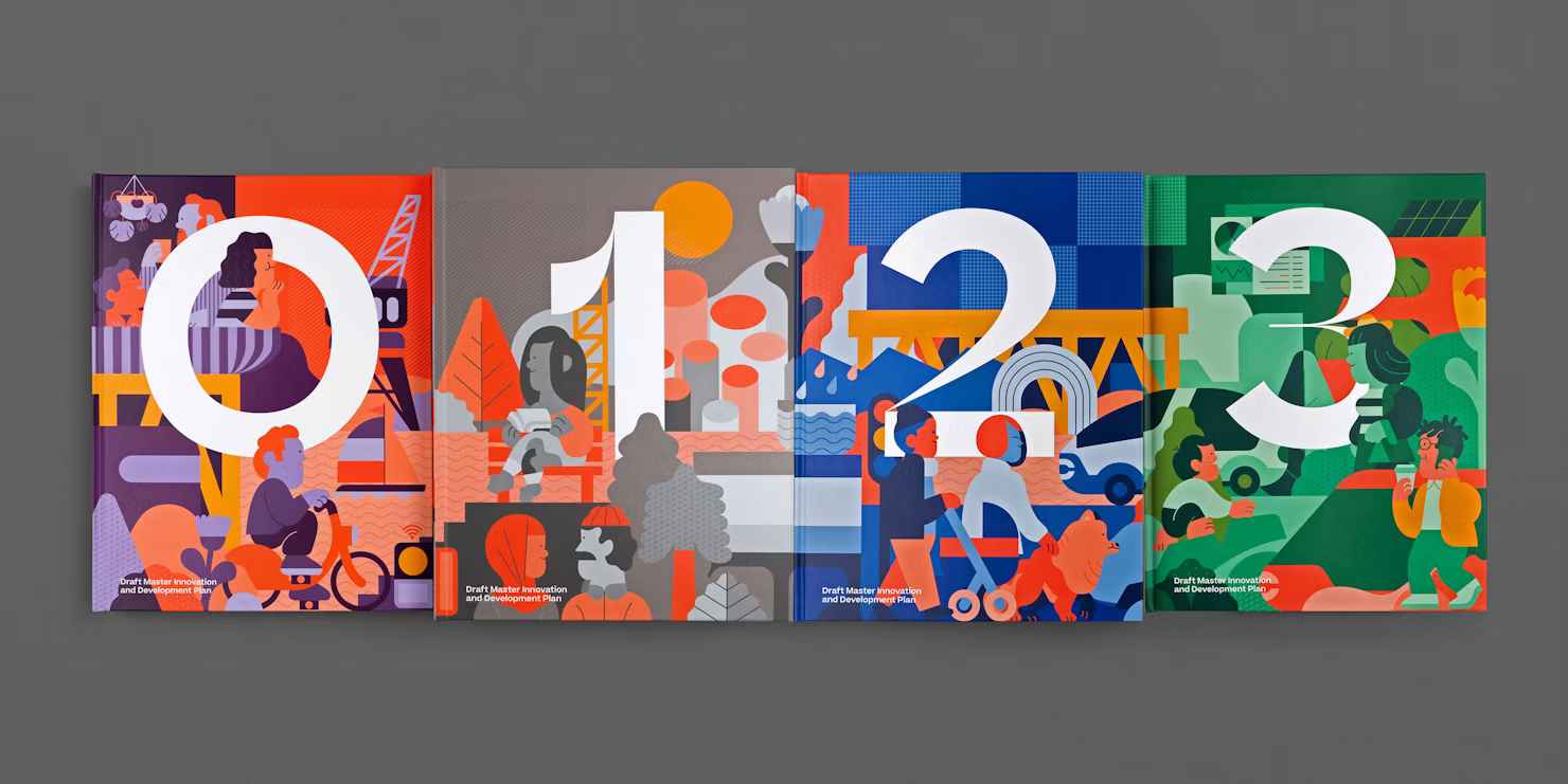
Four volumes, one slipcase. The master plan Sidewalk Labs filed with Toronto.
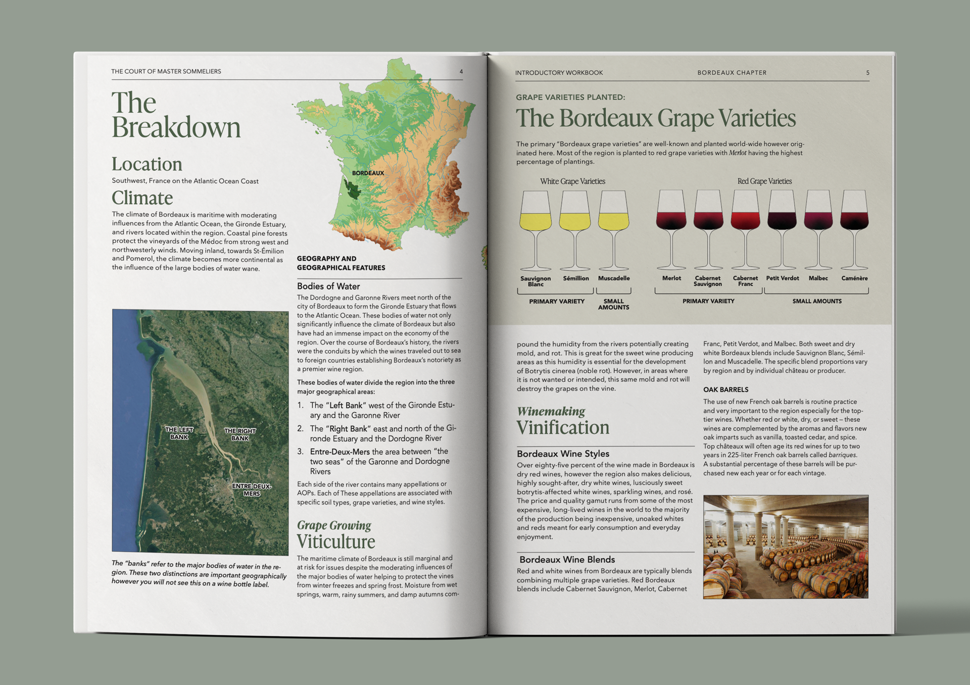
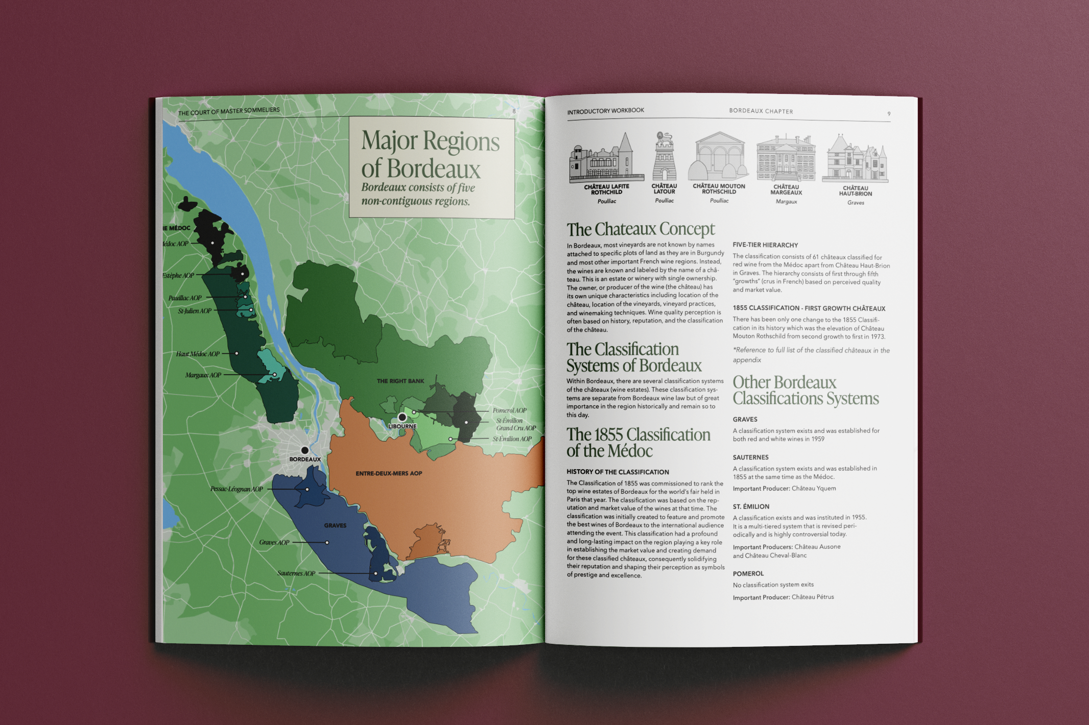
Introductory Sommelier Coursebook Court of Master Sommeliers / Information design Swipe to preview 2023
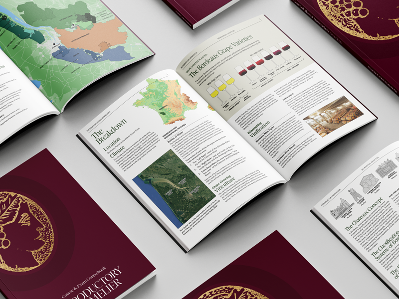
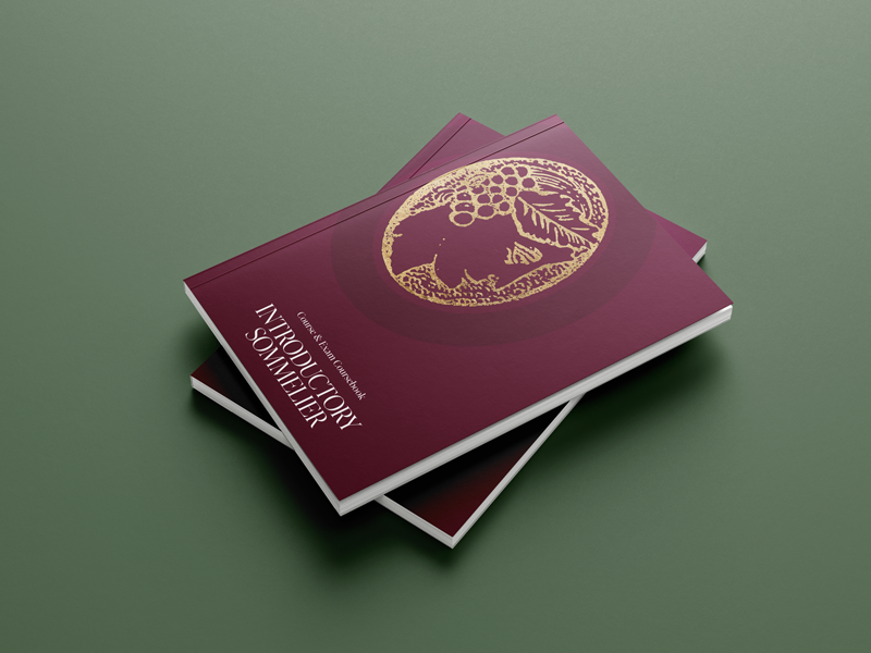
A coursebook rebuilt from the ground up with a Master Sommelier: 336 pages, custom cartography, wines colourised by hand.
Cavnue Sidewalk Infrastructure Partners / Brand & narrative Swipe to preview 2020
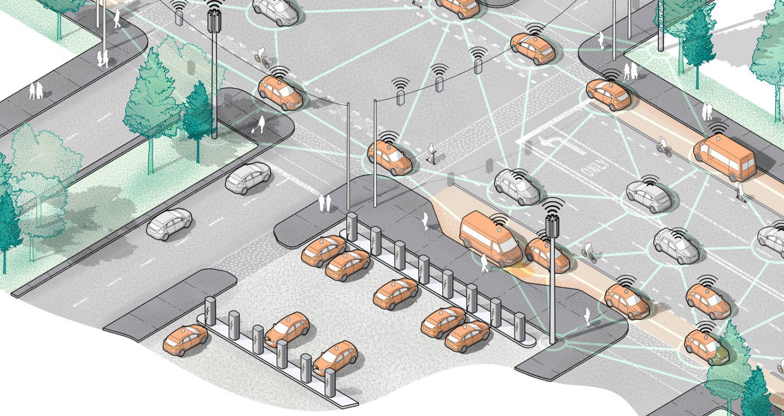
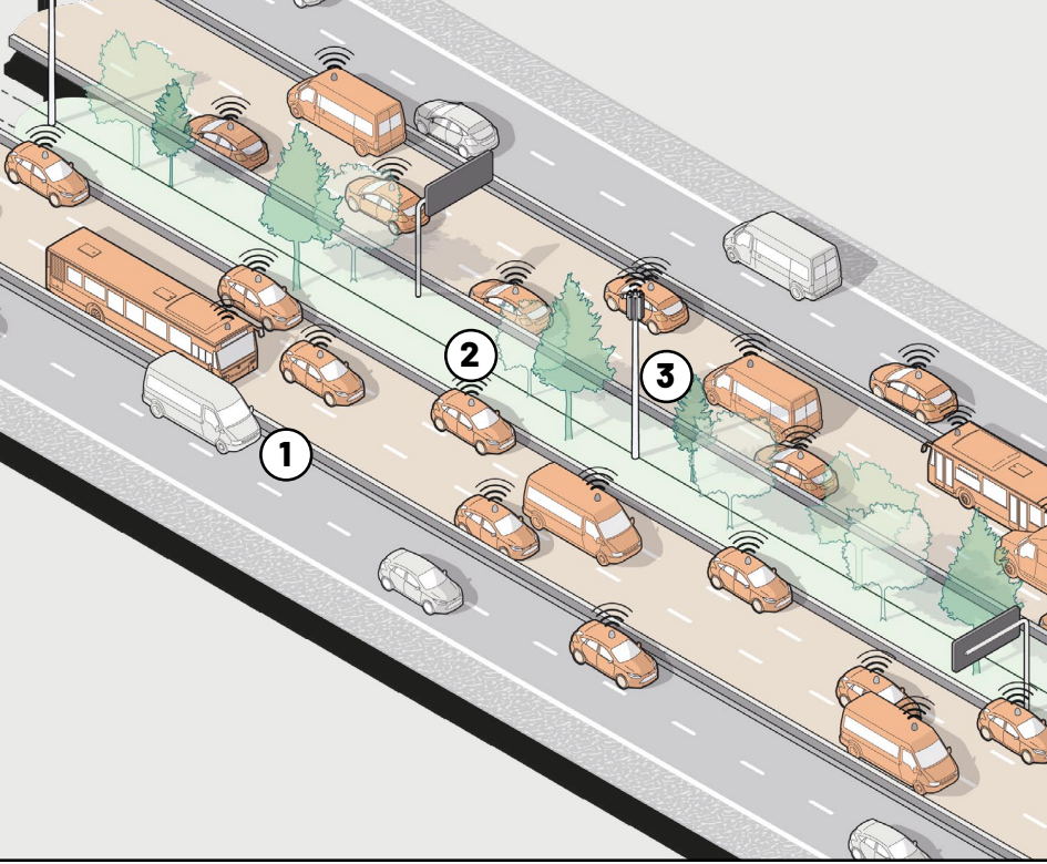
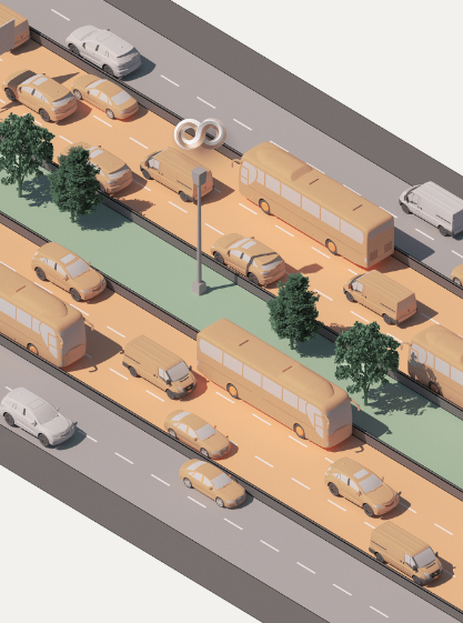
America’s first dedicated corridor for autonomous vehicles, drawn as an infinite loop.
Sidewalk Infrastructure Partners SIP • Alphabet / Brand identity Swipe to preview 2019–2022
One parent brand, five platform companies, a $1.4 billion raise.
Selected work
Press Selected coverage

TIME Best Inventions, Cavnue, America’s first dedicated corridor for autonomous vehicles. Cavnue2020
Bloomberg Sidewalk Infrastructure Partners and the market for resilient infrastructure. SIP2020–2022

Forbes Alphabet-backed SIP on financing the infrastructure the grid does not have yet. SIP2020–2022

Fortune The $1.4B raise across Alphabet, StepStone and Ontario Teachers’ Pension Plan. SIP2021
Fast Company Design and communications for infrastructure that has to be believed before it is built. SIP2020–2022

Dezeen The $2.5M Brooklyn headquarters, a hospitality-forward space for an infrastructure firm. The office2021
The next idea worth building deserves a story worth telling.

I help founders and companies make their brands undeniable.

Design & strategy director
Narrative architect
London • New York
Selected 2019–2026

I have led design teams at Google companies, designed books taught at Harvard, and helped launch America's first autonomous lane. Comprehension before composition: understand the material first, then design the structure that carries it.

All Brand identity Publication Information design Digital
Toronto Tomorrow cover set
01 Toronto Tomorrow Sidewalk Labs • Google / Publication system
SIP identity
02 Sidewalk Infrastructure Partners SIP • Alphabet / Brand identity
Cavnue connected lane
03 Cavnue Cavnue • SIP / Founding identity
04 Upgraid Upgraid / Brand & narrative
Robert E. Rubin digital platform
05 The Yellow Pad Robert E. Rubin / Digital archive
Introductory Sommelier coursebook
06 Introductory Sommelier Coursebook Court of Master Sommeliers / Information design
08 Native Markets Native Markets / Identity & digital
09 Fund for Public Housing Fund for Public Housing, NYC / Digital & giving
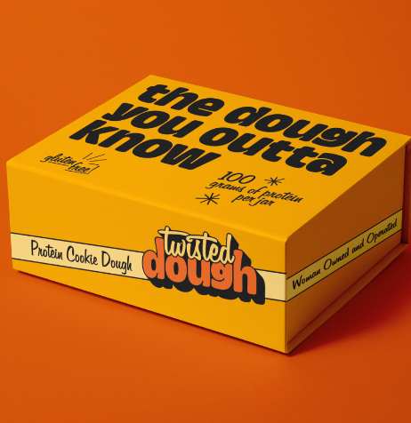
Twisted Dough shipper carton
10 Twisted Dough Twisted Dough / Consumer rebrand
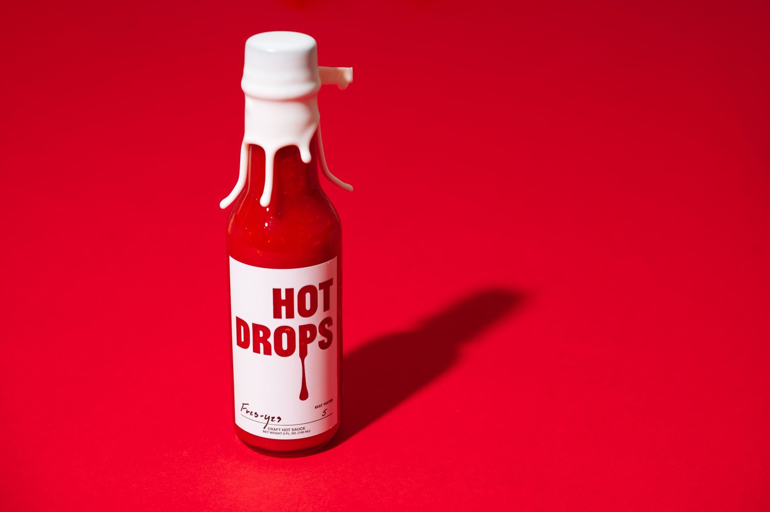
Hot Drops Fres-Yes bottle
12 Hot Drops Hot Drops Original / Identity & packaging
Also worked on No case study: short version
{{ c.name }} {{ c.name }} {{ c.discipline }}/{{ c.year }} {{ c.note }}
Project {{ p.num }}{{ p.client }} / {{ p.mode }}{{ p.year }}

{{ p.title }}

{{ p.blurb }}

{{ p.heroOverlayKicker }} {{ p.heroOverlay }} {{ p.title }} CATALYST®
Role{{ p.role }}
Client{{ p.client }}
Deliverable{{ p.deliverable }}
Credential{{ p.credential }}

{{ p.lead }}

Challenge

{{ p.challenge }}

Objective

{{ p.solution }}

Results

{{ p.impact }}

Challenge · Solution · Impact, copy to come

The case-study frame is set. Send a paragraph on the constraint, what you built and what it moved, and it drops straight into these three slots.

{{ s.figure }} {{ s.label }}
Team leadership

{{ p.leadershipLead }}

{{ l.title }} {{ l.desc }}

Before & after

{{ p.beforeMeta }}
{{ p.cmpBeforeName }}, previous packaging {{ p.cmpAfterName }}, redesigned packaging Inherited Redesigned
Drag across to compare Eleven of sixteen SKUs shown

Direction

Eight boards
Four rules
{{ d.head }}
{{ sl.a }} {{ sl.b }}

Logotype anatomy

Twisted Dough logotype
Colorway

{{ p.knockTitle }}

{{ p.knockNote }}

www.hotdropsauce.com Whiting Original Heat factor {{ knockName }} {{ knockHeat }}
Flavour
Label ground {{ knockChipLabel }} {{ knockChipTypeLabel }} {{ knockType }}

Toggle the knockout: printed, the wordmark is one flat ink. Knocked out, it fills with the sauce. Which is exactly the colour that goes into the palette above.

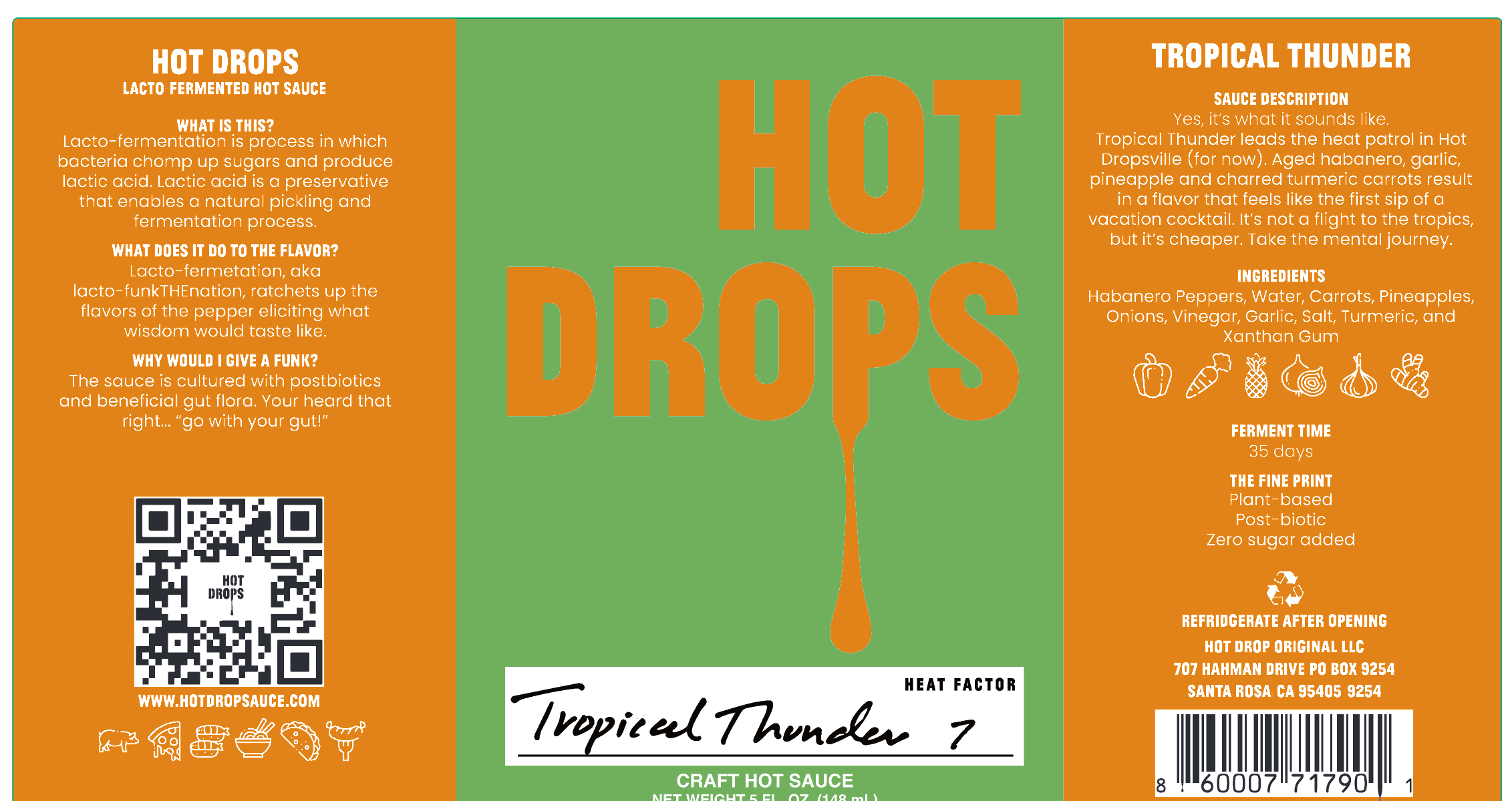
MCC press proof for the Tropical Thunder label {{ dieActiveTitle }} {{ dieActiveBody }}
Die5.570 × 3.010 in, 0.0156 in corner, 0.125 in gap SubstrateClear BOPP 2.0mil / S7000ER / 1.2PET SeparationsCMYK + white + D-stock clear: the clear plate is the sauce PressMCC Napa, job 81800. Seven items on one proof

{{ p.annoTitle }}

{{ p.annoNote }}

Mailer dieline artwork
{{ annoActiveTitle }} {{ annoActiveBody }}
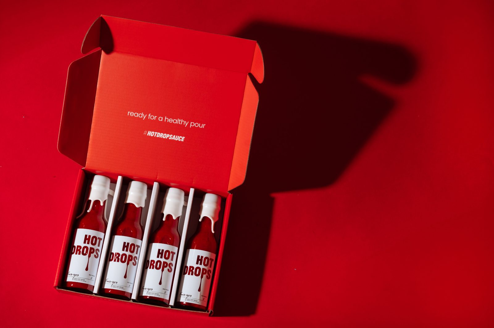
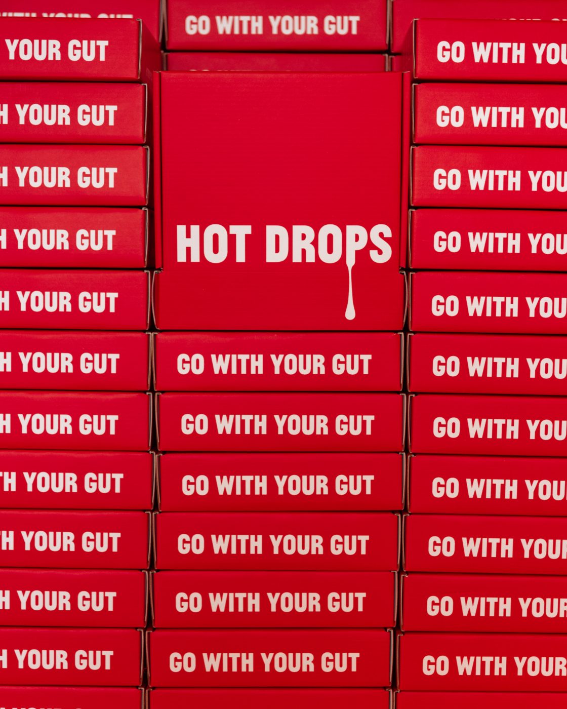
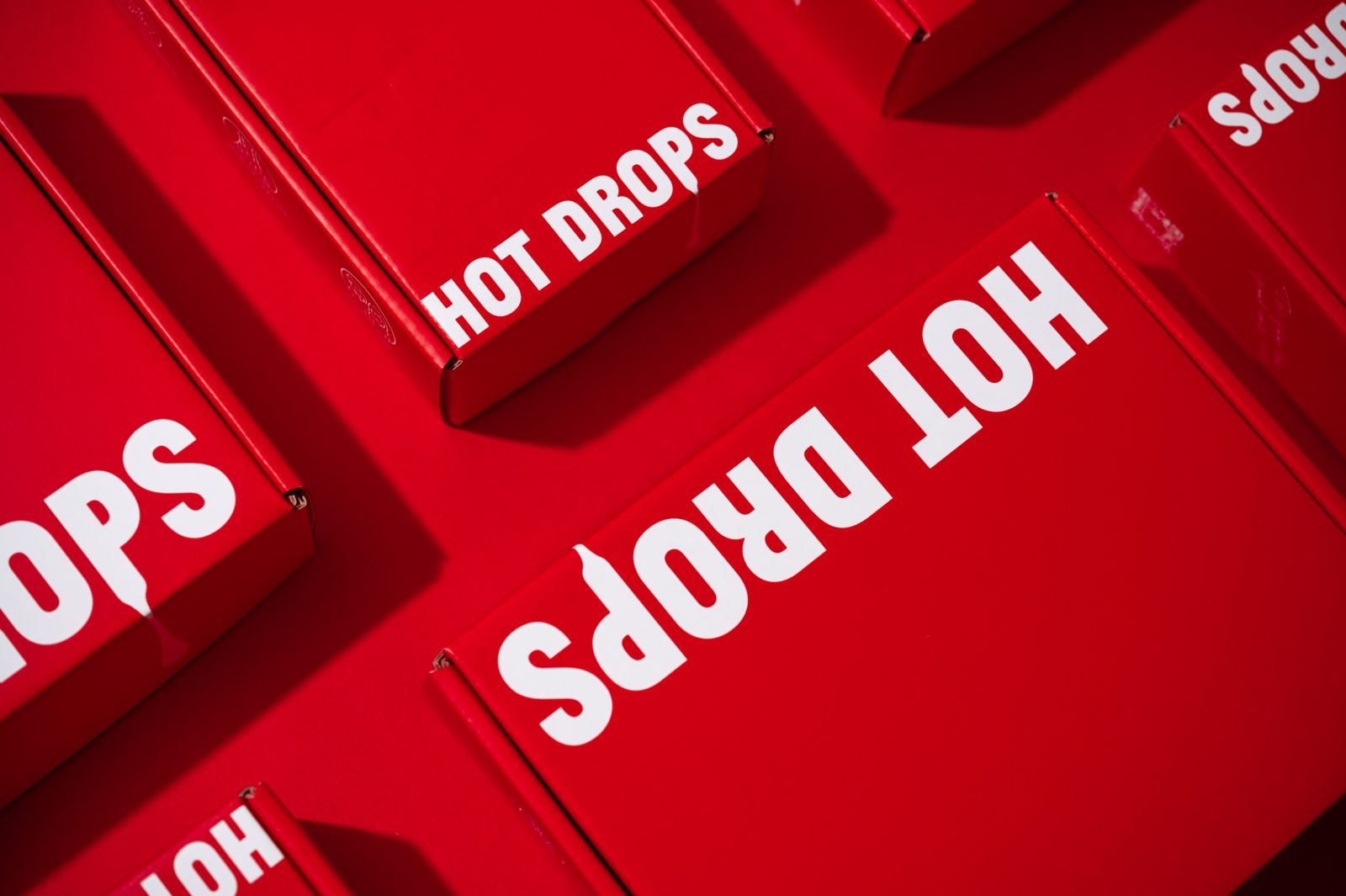
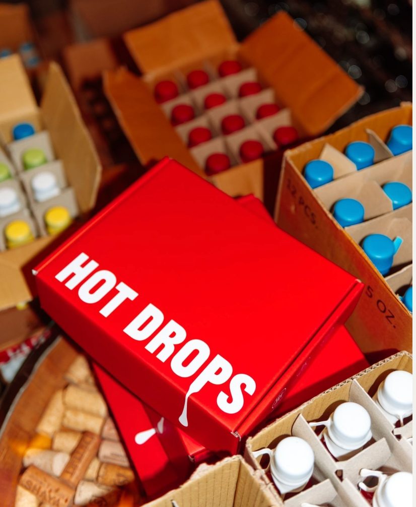
The box, made Printed, folded, packed. The mailer with the four-bottle insert seated inside.
The mailer open, four bottles seated in the insert Printed mailers stacked, “go with your gut” on every side panel Closed mailers laid out on red A closed mailer on the fulfilment table among case boxes of bottles

{{ p.socialTitle }}

{{ p.socialNote }} Pick a cut on the right; tap the frame to pause.

hotdrops · 4h Send message hotdrops Santa Rosa, California hotdrops {{ socialTag }} #HOTDROPSAUCE · Go with your gut {{ socialChrome }}

Palette & type

{{ p.paletteNote }}

{{ sw.role }} {{ sw.name }} {{ sw.hex }}
Highlight tint {{ sw.tint }}
Sauce, sampled {{ sw.sauce }}
Sixteen approved pairings How to read a tile: the outer field is the label ground, the logotype carries the counter colour, and the bottom fifth is the ground lightened. The highlight tint the labels use behind the band and inside the letterforms. Black is never a fill; it is the hairline and the letter outline, which is what holds every pairing together at shelf distance.
{{ pr.label }}
Texture & surface
{{ tx.name }} {{ tx.name }} {{ tx.note }}
{{ p.typeNote }}
{{ tr.sample }} {{ tr.name }} {{ tr.role }} Foundry {{ tr.foundry }} Use {{ tr.use }} {{ tr.spec }}

Execution

{{ p.execNote }}

{{ ef.figure }} {{ ef.label }}
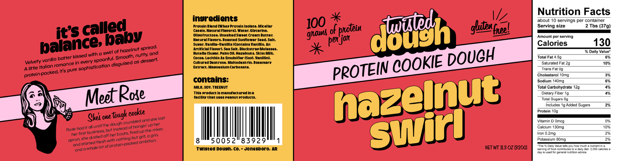
One dieline, four panels — story, ingredients, front, nutrition Hazelnut Swirl label, flat artwork across all four panels
The flavour wall, one saturated ground per SKU
{{ k.name }} jar
{{ k.name }}

{{ p.axoTitle }}

{{ p.axoLead }}

{{ ax.title }}
{{ ax.kicker }} {{ ax.title }} {{ ax.desc }}
{{ ax.title }}
{{ ax.kicker }} {{ ax.title }} {{ ax.desc }} Design choices {{ ax.note }} {{ ck.label }} {{ ck.note }}

{{ p.phasesTitle }}

{{ p.phasesLead }}

{{ p.phaseActive.window }} {{ p.phaseActive.title }}

{{ p.phaseActive.desc }}

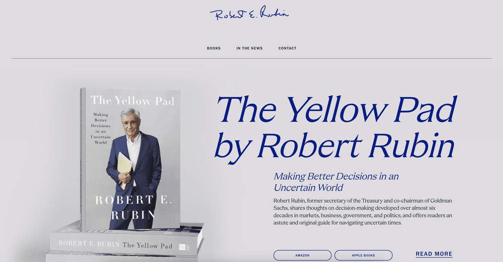
The site theyellowpad.com

The mark, assembling

One hundred and three particles resolve into a C. Separate holdings, one platform: the logo does the argument before a word of copy is read.

CATALYST®
{{ g.head }} {{ g.meta }} {{ g.note }} {{ g.alt }} {{ g.alt }}
{{ p.galleryNote }}

{{ p.craftTitle }}

{{ p.craftLead }}

{{ p.craftNote }}

{{ c.kicker }} {{ c.title }}

{{ c.desc }}

{{ chip.label }}
{{ ph.cap }}
{{ ph.cap }}
{{ f.figure }} {{ f.label }}

{{ c.aside }}

The wine colour system

Every glass hand-coloured to its true appearance, then placed chapter by chapter, white before red, so the varieties a student meets in each region arrive in the order the book teaches them.

64 Glasses drawn
16 chapters

{{ wineActiveName }}

{{ wineActiveNote }}
{{ band.label }} {{ band.count }}
{{ w.name }}
{{ w.name }} {{ w.desc }}

The first growths

Five châteaux drawn for the Bordeaux chapter, the 1855 classification rendered in the same hand as the glassware, so architecture and appellation sit in one visual language.

Bordeaux chapter
1855 classification
{{ c.name }}
{{ c.name }} {{ c.appellation }}

Cartography

Every chapter is anchored by a locator, a terrain map, and an appellation map, one consistent cartographic key across fifteen regions, so a student reads geography the same way each time.

Three map types
Fifteen regions
{{ m.label }}
{{ m.region }} {{ m.label }}

Taxonomy

The source text was coded for visual needs and narrative weight before design began. Every asset in the book traces back to that tagging system.

Asset code format

[Type][Scale], [Role]

Types

P Photography M Map C Chart D Diagram X Technical section I Icon IL Illustration
V0The Overview V1The Plans V2The Urban Innovations V3The Partnership

{{ t.tier }}

{{ t.role }}
{{ e.code }} {{ e.title }} {{ e.desc }}

Palette and surface

Read together, the five sit in one narrow band of desaturated, dusty tone — close enough in value that no platform outranks another, distinct enough in hue that any two can share a slide without arguing. It is a family that behaves like a mineral set rather than a tech spectrum: nothing fluorescent, nothing primary, no one company allowed to become “the loud one.” Sandstone anchors them from behind, so the parent reads as the ground the others are cut from.

Sandstone #E4DDD1 · SIP Etched fine stone The parent, blind embossed, never inked
Melon #E7BF98 · Cavnue Wet resin Warm signal, the lane that never ends
Brass #C69D89 · Resilia Brushed metal Milled metal, charge held at rest
Slate blue #96BBC9 · CoFi Frosted glass Cool air, coverage over a city
Sea glass #91BAB1 · Polysift Tumbled glass Recovered material, re-tinted
Periwinkle #7A8EBA · Verrus Wet clay Cold storage, the data floor
01 Etched fine stone The SIP logotype is only ever pressed into stock, no ink, no colour. It reads as carved rather than printed, so the parent never competes with the companies.
02 Wet clay and glass Every platform mark is modelled as a physical object: soft-bodied, slightly wet, lit from one side. Sub-surface scatter keeps the forms organic where competitors go flat and vector.
03 Brushed metal Resilia carries a milled-metal finish: anisotropic highlights that streak with rotation, so the mark declares its axis as it turns.
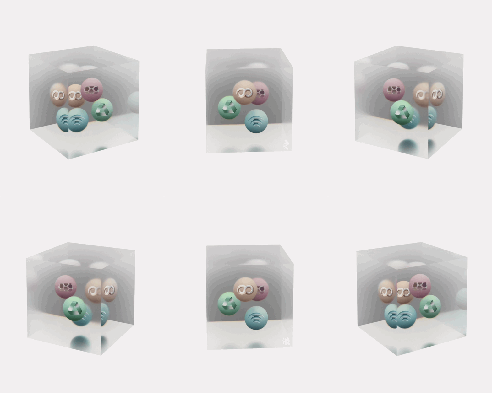
04 Frosted depth The ecosystem cube is a frosted volume the marks are suspended inside. Depth of field does the hierarchy: whichever platform is being discussed comes into focus.
SIP logotype, blind embossed
Parent brand The parent is the ground, not another logo in the set. SIP is foundational by design: a logotype pressed into stock, no colour, no motion, no render. It never appears alongside its companies as a peer, it appears underneath them as the substrate they were cut from — the thing that was already there when each platform was founded. Every platform is the opposite: a 3D-modelled object, lit and suspended in air so it can be examined from any angle. Innovation you can walk around. Each mark holds one idea — a corridor, a coverage dome, a storage grid, a conveyor loop — built as a physical thing rather than drawn as a symbol, so rotating it reveals the argument instead of just the silhouette. Identity, website, and every RFP, white paper, press release, animation and illustration the firm issued, produced single-handedly.
01 · Ground state The parent is fixed In quantum terms SIP is the ground state: the lowest, most stable energy level a system can occupy. Blind embossed, no colour, no motion. Everything else in the family is measured as a displacement from it, and it never competes with the companies it launches.
02 · Excited state Each platform is a particle Energy applied to a ground state kicks a particle up into a discrete orbit — never a smooth gradient, always a defined level. Each platform is one such quantum leap out of SIP: a single primitive form rotated, extruded and sectioned until the sector it serves, road, grid, wireless, waste, compute, is legible in the geometry itself.
03 · Observation Observed in four dimensions A particle’s state is only resolved once observed. Every mark was built to be examined in 4D space — modelled, spun, cut and re-lit for film, stage and print — so what it does under motion is the identity, not a treatment applied afterwards.

Five companies, one physics

The five platform marks suspended as particles in a cube

Five sectors, five identities, one family. The logic is borrowed from quantum mechanics: the parent is the fixed state and each platform is a particle launched out of it, then observed in four-dimensional space — a single form rotated, extruded and lit until its behaviour over time becomes the identity.

That gave every company the same physical laws to obey. One idea per mark. Modelled, never drawn. Soft-bodied and material rather than the cold vector geometry infrastructure brands default to. Lit from a single source so the whole set could be composited into one frame without any of them looking borrowed.

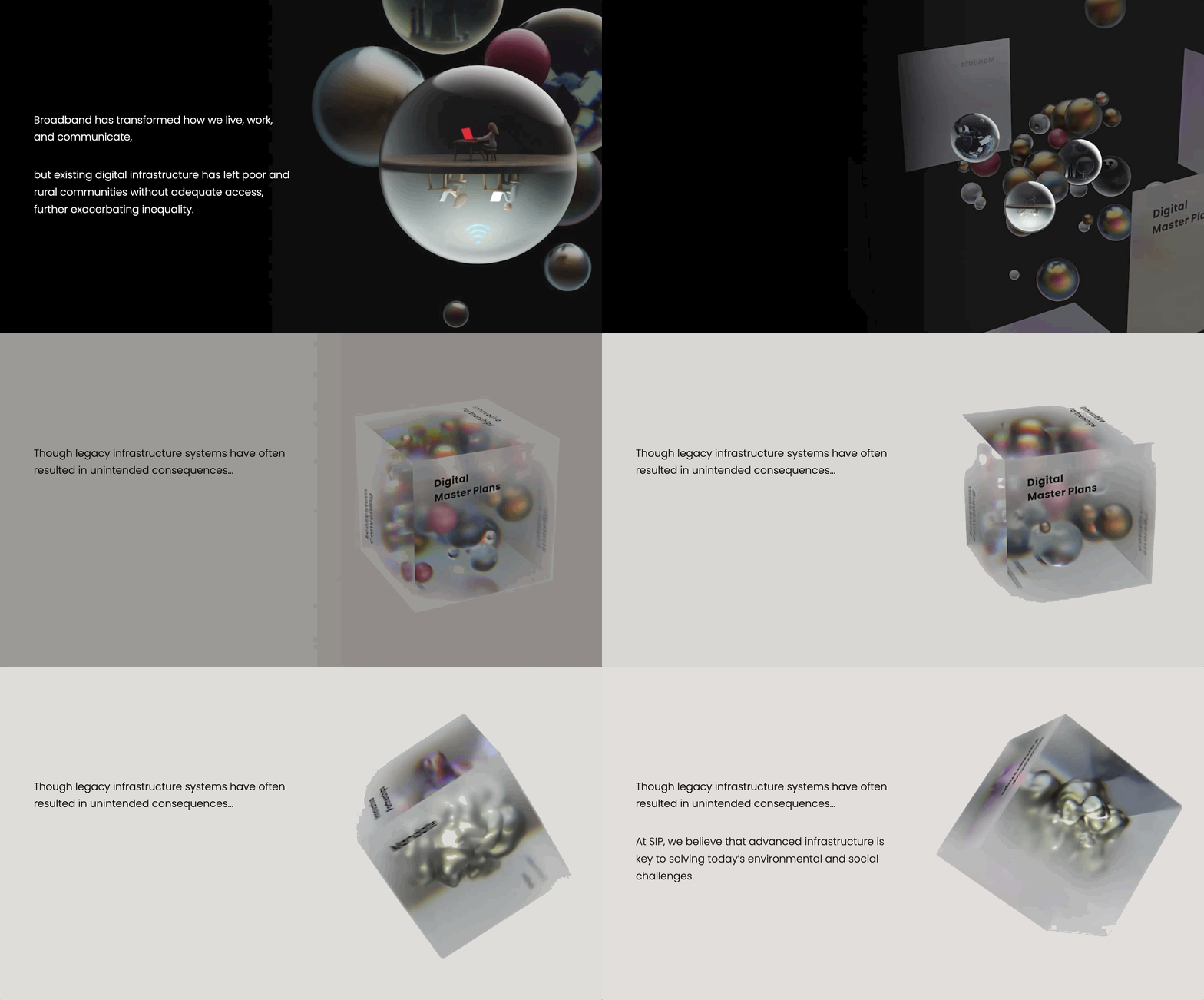
The cube is where they are observed together: five platforms suspended in one volume, depth of field doing the hierarchy so whichever company is being discussed comes into focus while the others stay present behind it.

Cavnue mark in motion
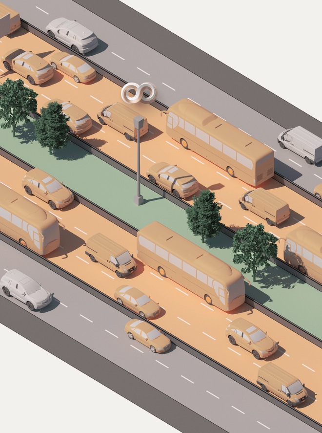
Cavnue America's first dedicated corridor for autonomous vehicles. The mark is the corridor itself folded into an infinite loop, a dedicated lane with no start and no end, drawn in two colours so the neutral asphalt and the melon lane stay distinct as they pass through each other.
Verrus mark
Verrus Next-generation data centres, launched as Circular Compute: carbon-negative computing, with waste heat driving direct air capture.
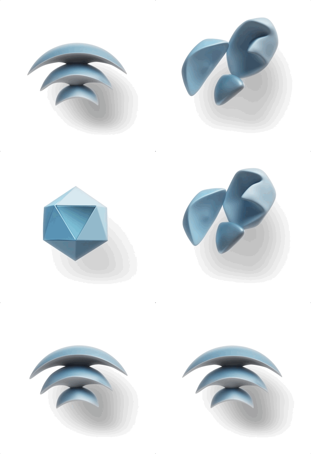
CoFi mark rotating into the Dense Air mark
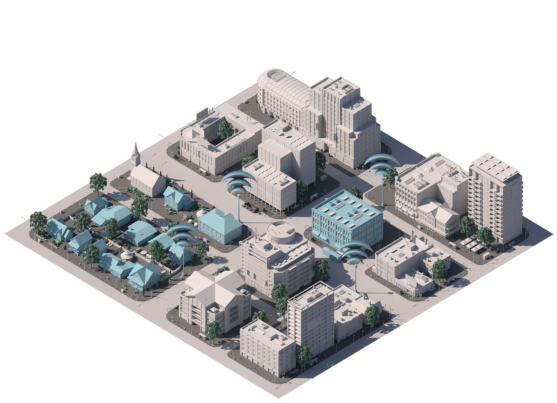
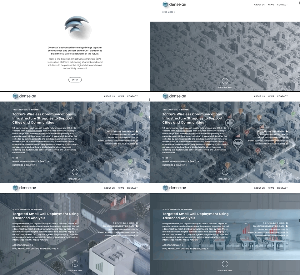
CoFi Shared wireless infrastructure for smart cities. The mark is a coverage dome built from the arcs everyone already reads as WiFi, then it rotates in space and resolves into the Dense Air mark, showing the separate coverage layers assembling into one network.
Verrus mark in motion
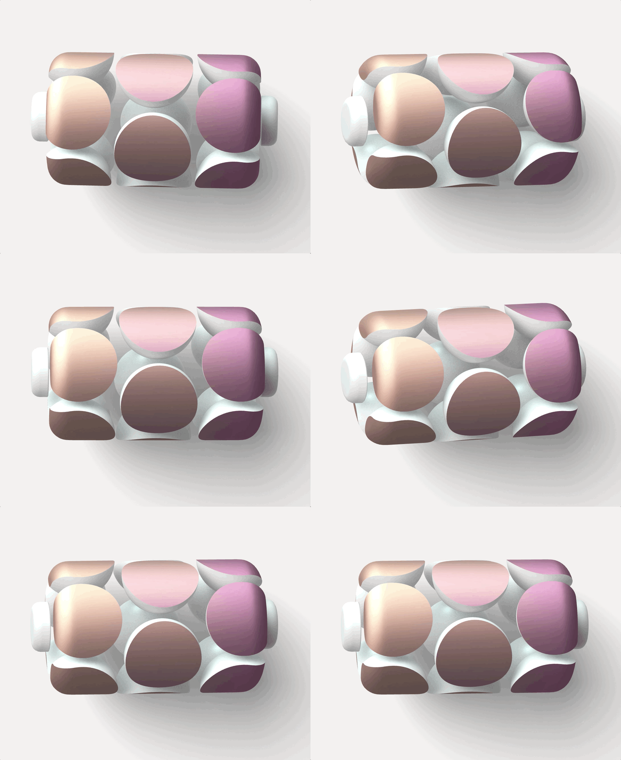
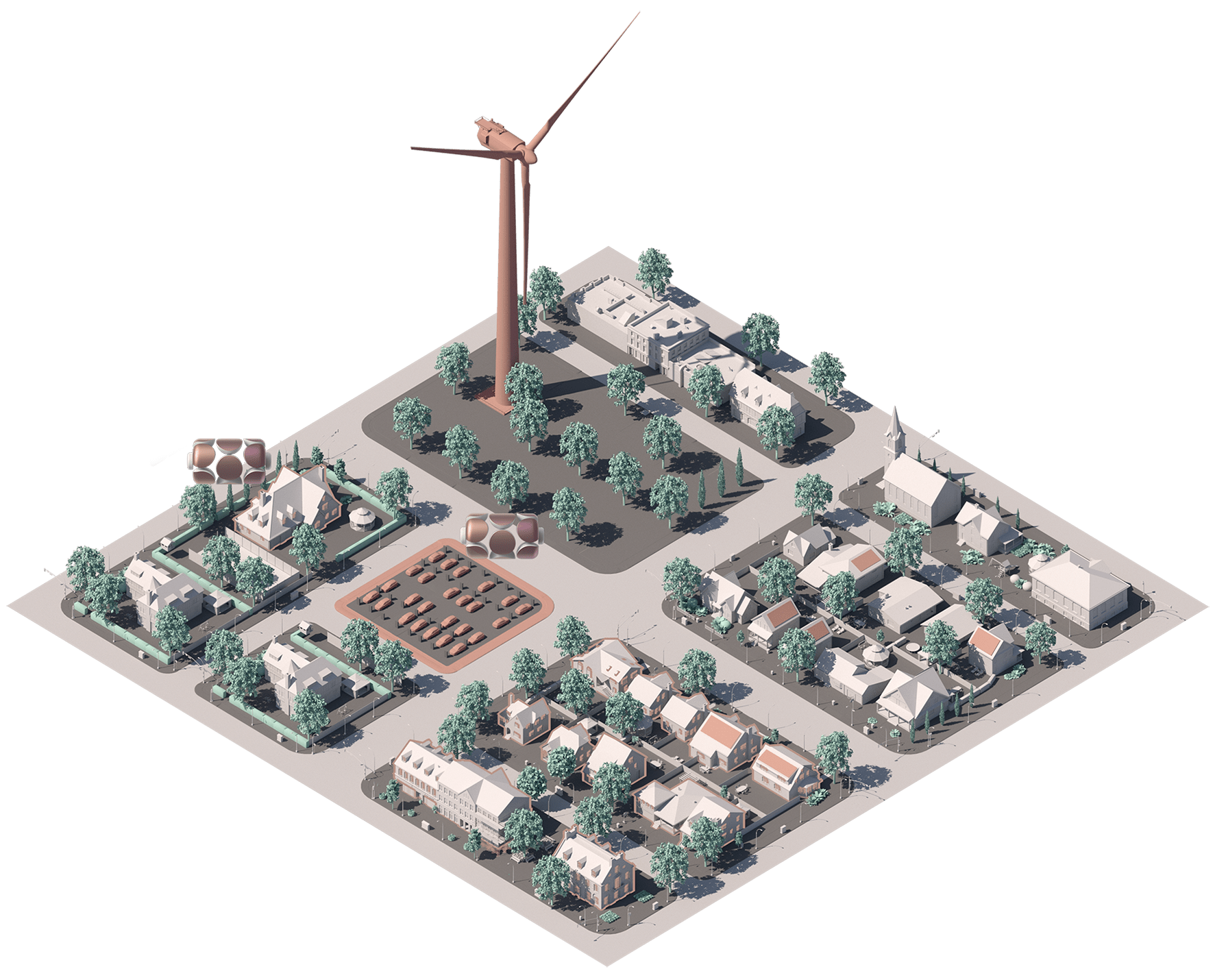
Resilia Advanced power plants reimagined for the energy transition. The mark is an interconnected grid of storage cells running hot to cold, every node linked to the next, so the logo reads as a network holding charge rather than a single plant.
Polysift mark in motion
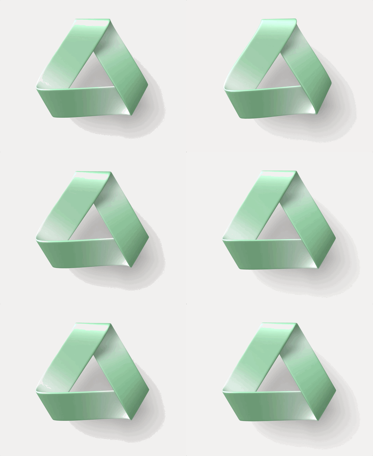
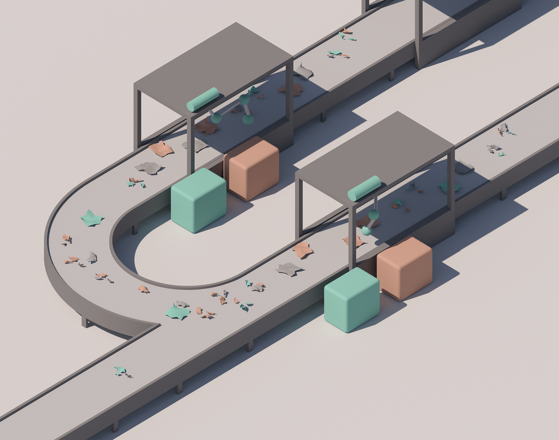
Polysift Robotics-enabled recycling for the circular economy. The mark updates the recycling triangle into a möbius loop, one continuous surface reading as a conveyor belt that keeps returning material to the front of the line, so waste rotates instead of ending.
What each platform is solving
CoFi mark CoFi Solving — Digital divide High-speed connectivity of at least 100 mbps, aimed at borderless classrooms and rapid, equitable wireless build-out.
Resilia mark Resilia Solving — Grid failure North America’s largest virtual power plant, capacity during California blackouts, 100k+ metric tons of CO2 cut annually.
Cavnue corridor, modelled Cavnue Solving — Transit deserts New public transit across 10 economic opportunity zones in Greater Detroit, mobility for underserved communities.
Polysift mark Polysift Solving — Plastics crisis A first-of-its-kind recycling facility diverting ~100MM pounds of plastic a year and opening markets for discarded polymers.
The summary band that closed most investor conversations.

In pursuit of the raise

Almost everything here was made to move capital: platform theses, system diagrams, RFP responses to cities, policy white papers, the website, and the rooms themselves, launch events, a salon series, and closed logistics sessions hosted at Google. Nearly all of it is confidential; what follows is what can be shown.

Platform theses, one spread per company
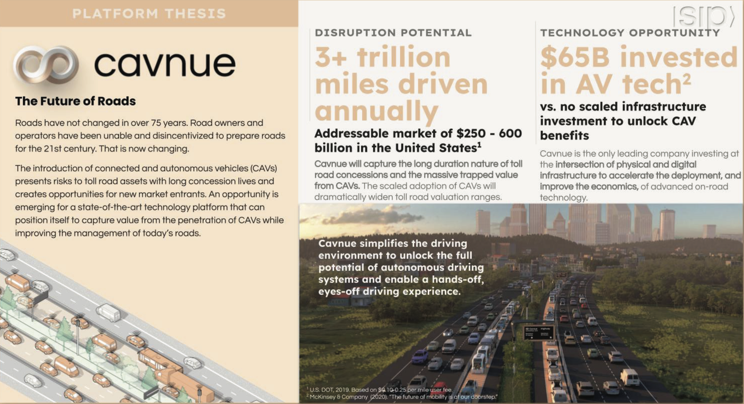
Cavnue platform thesis spread
CavnueThe future of roads
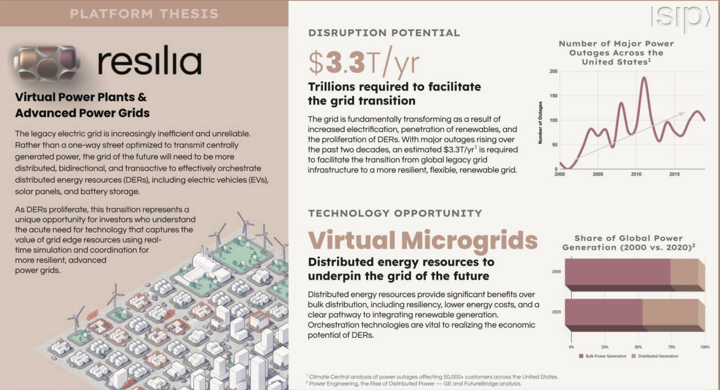
Resilia platform thesis spread
ResiliaVirtual power plants
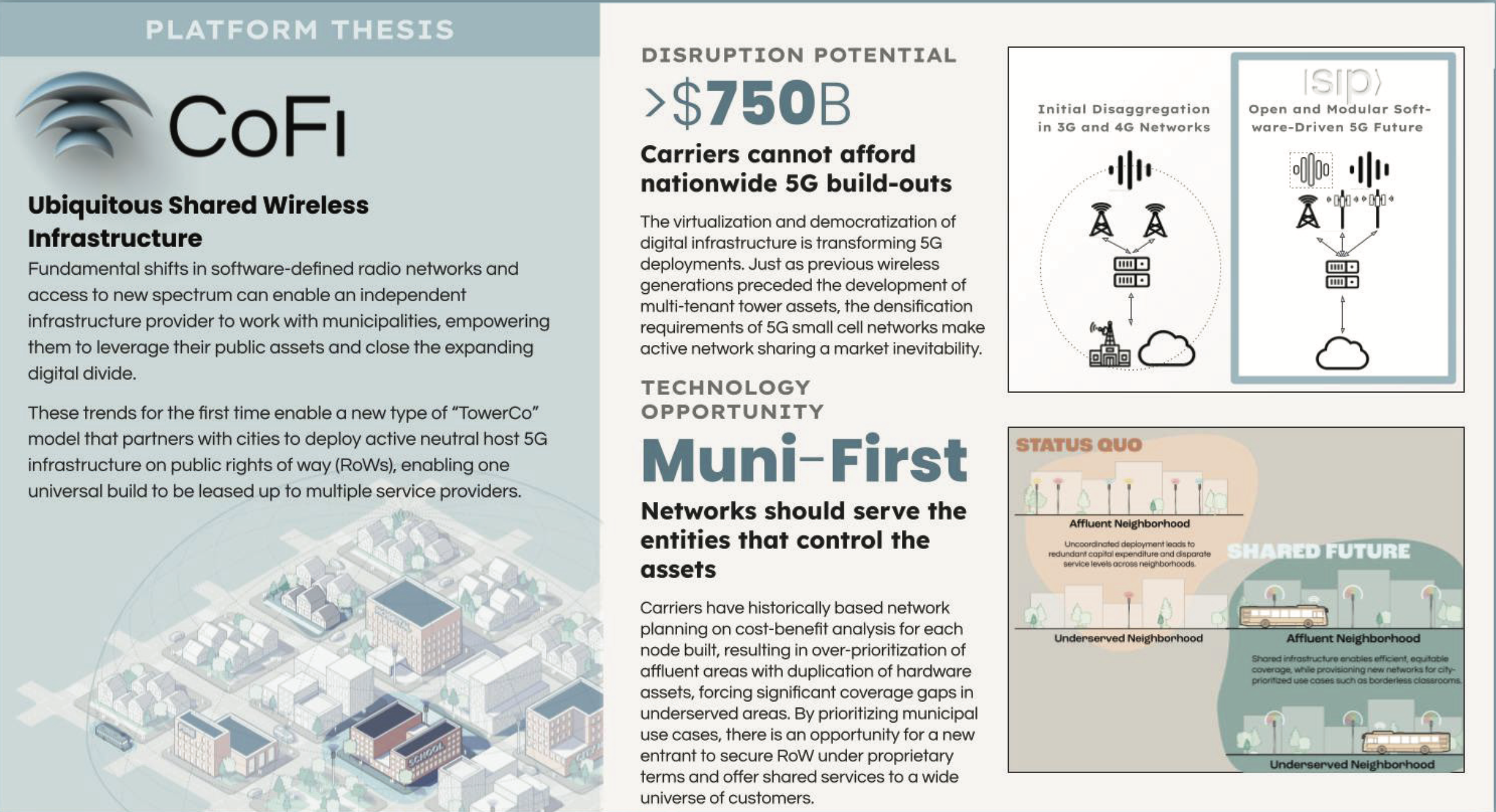
CoFi platform thesis spread
CoFiShared wireless
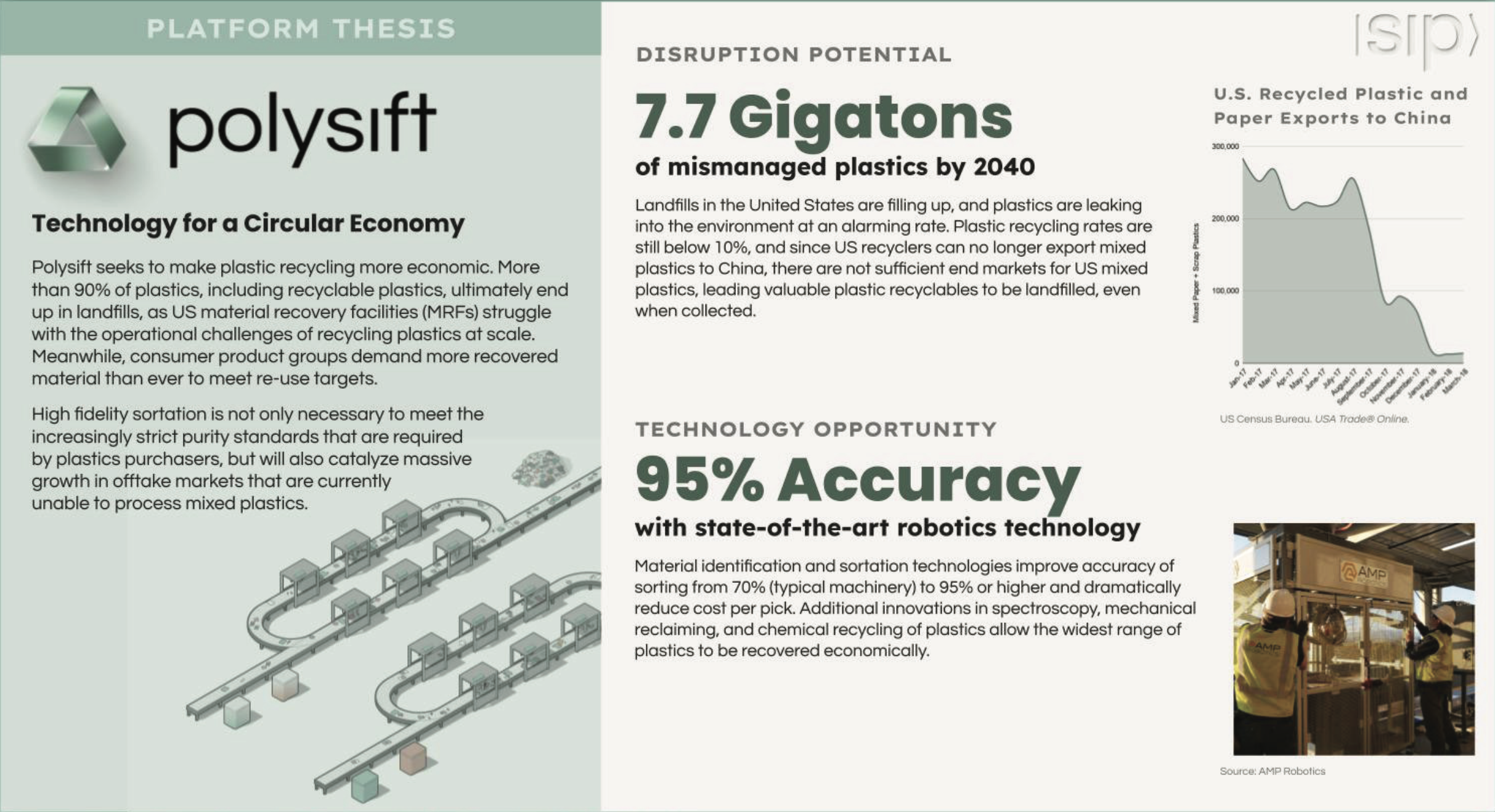
Polysift platform thesis spread
PolysiftCircular economy
White papers and RFP responses
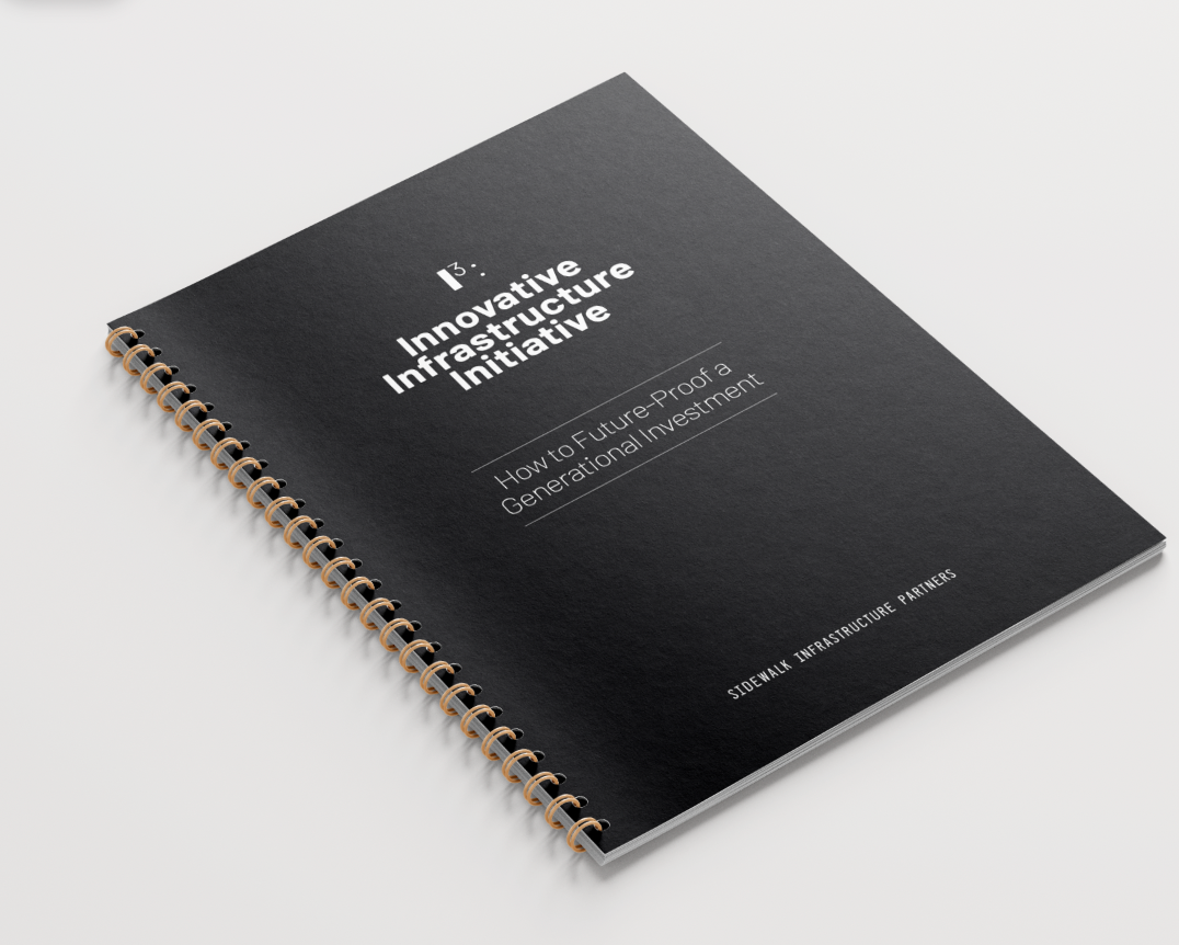
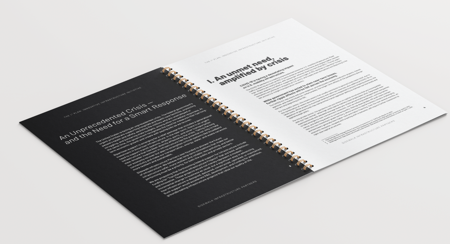
I³ PlanI³ Plan interior spread
I³ PlanFederal policy proposal · hover for interior
CAV Corridor Concept
CAV Corridor ConceptMichigan RFP response
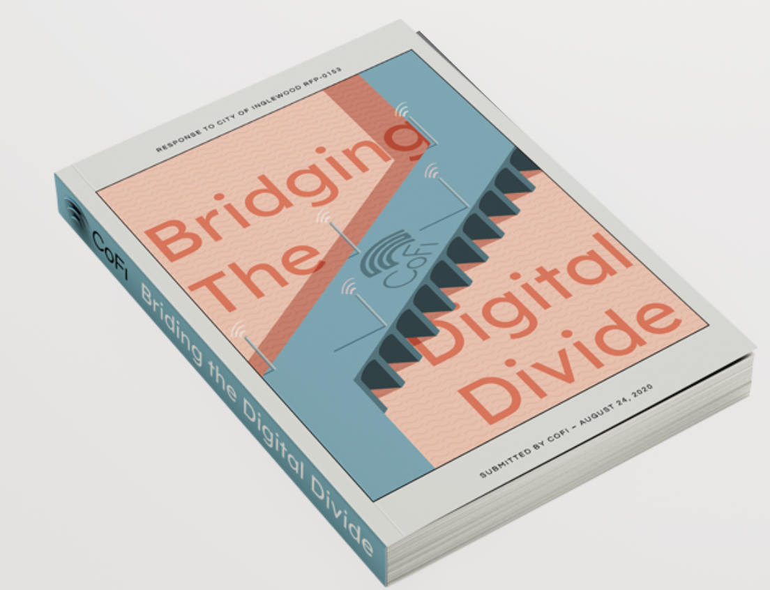
Bridging the Digital Divide
Bridging the Digital DivideCoFi, City of Inglewood RFP

The Salons

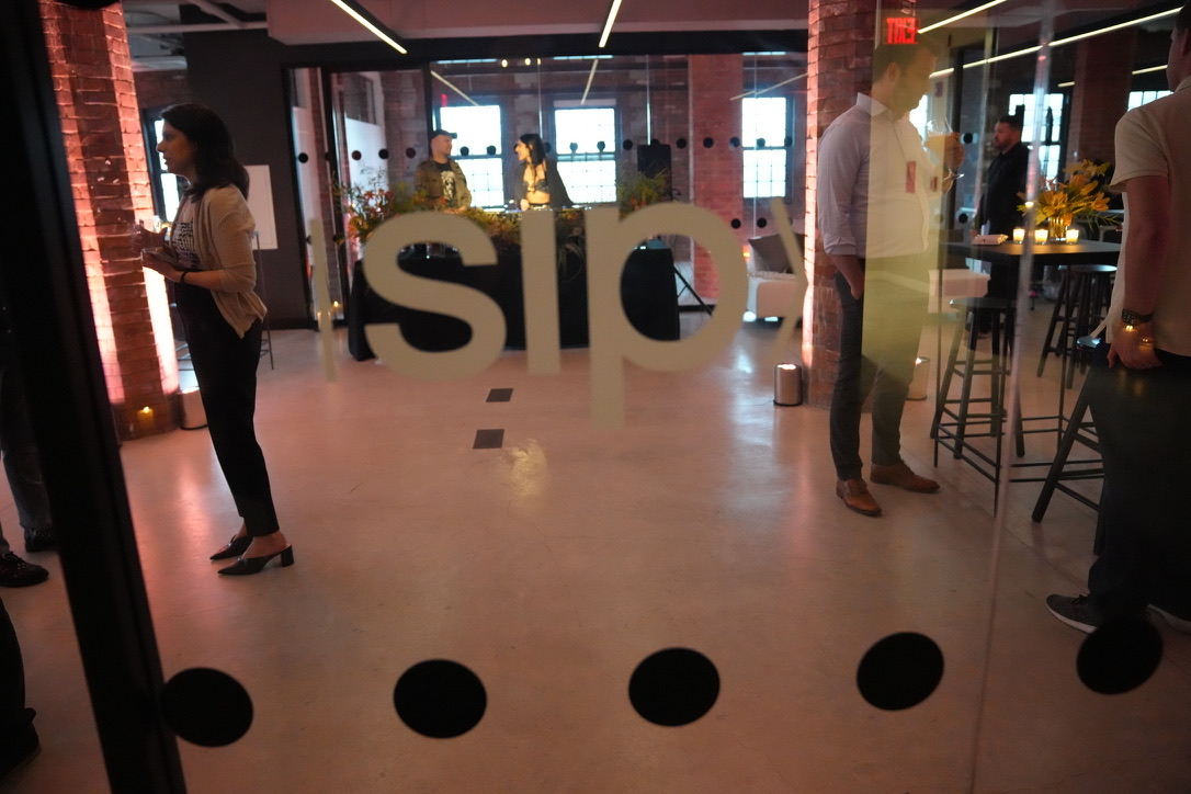
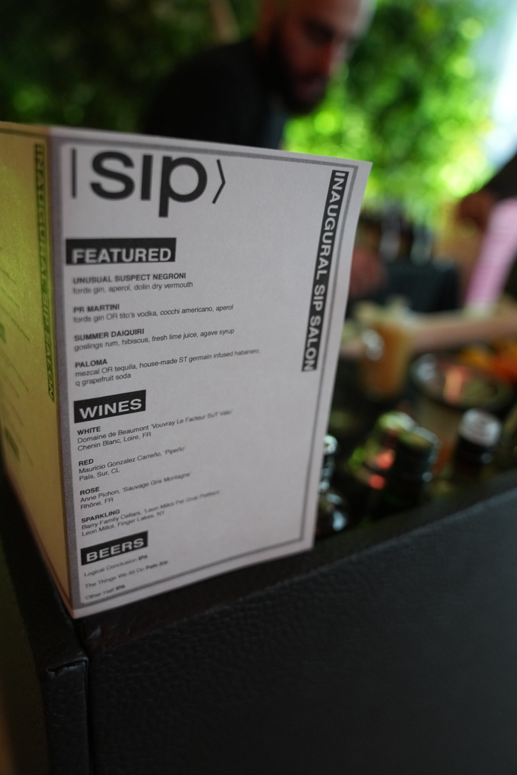
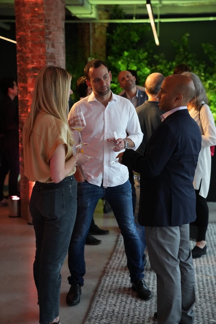
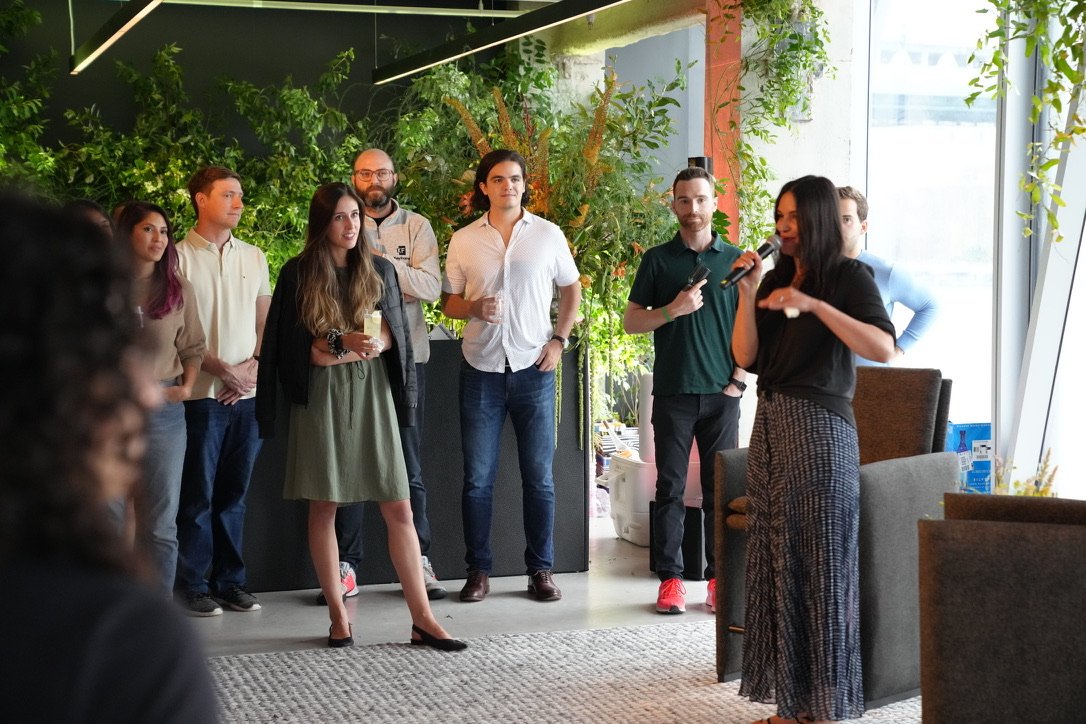
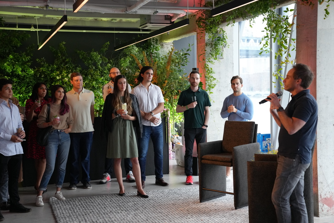
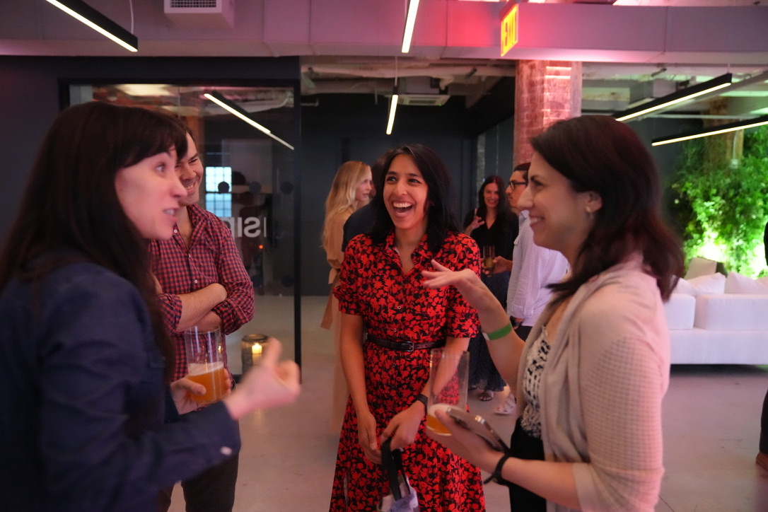
Capital moves in rooms. The Salon series put investors, city officials and operators in one loft in Dumbo, neon mark on the DJ booth, a drinks list built for the night, no slides. Closed logistics sessions ran on the same model, hosted at Google.

Guests arriving, mark vinyl on the glass
Arrival, 41 Flatbush, Brooklyn
Inaugural Salon drinks menu
Drinks list, designed for the night
Investors talking over wine
Operators and investors
Co-CEO addressing the room
No slides, one microphone
The full room during remarks
The room, mid-remarks
Guests in conversation
Between sessions
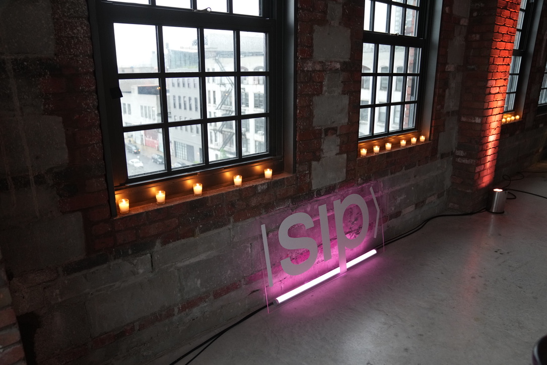
Pink neon mark against brick
The mark, fabricated in neon

Two summits at Google

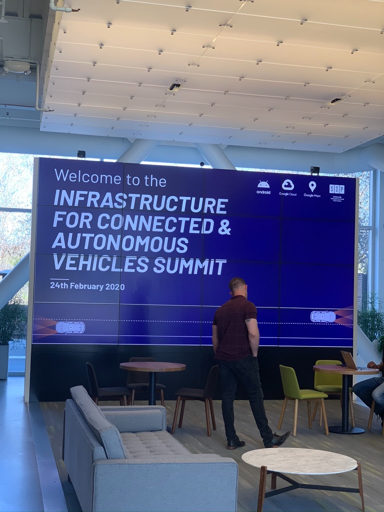
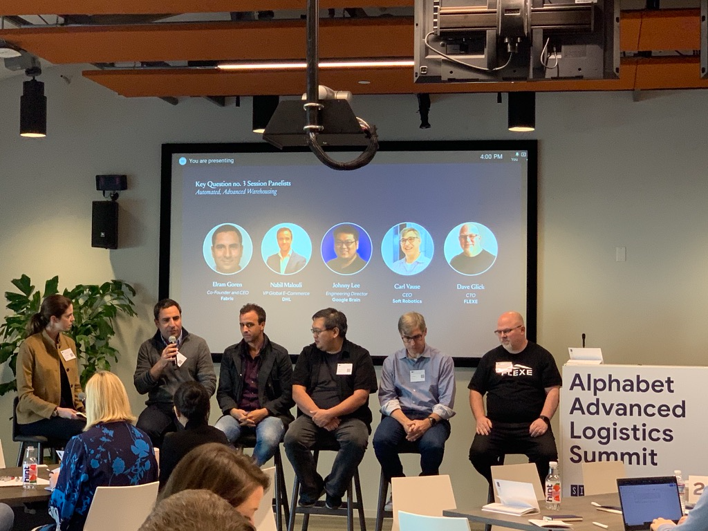
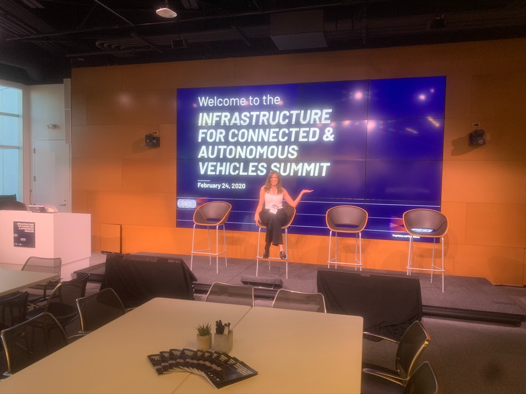
Both invitation-only, both hosted inside Google: one on infrastructure for connected and autonomous vehicles, one on advanced logistics. I built the identity, the environment, the printed programme and every slide in the room, panels of city officials, OEMs, DHL, Flexe, Soft Robotics and Google Brain.

Infrastructure for Connected & Autonomous Vehicles Summit, February 2020
Summit title wall in the Google lobby
Title wall, lobby
The main stage before doors
Main stage, before doors
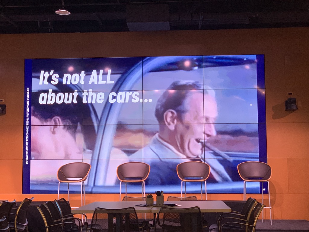
Slide reading it is not all about the cars
Session slide
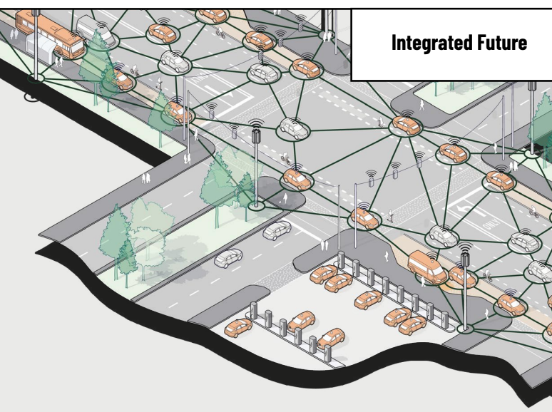
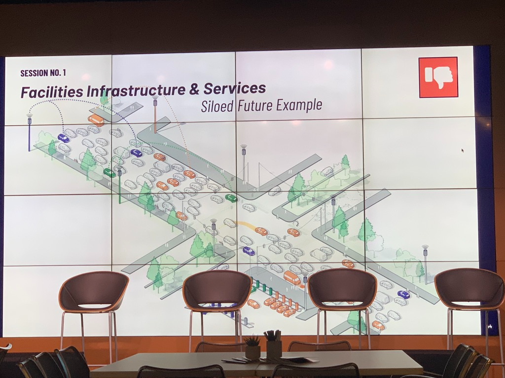
Isometric diagram of a siloed infrastructure future
Systems diagram, the siloed future
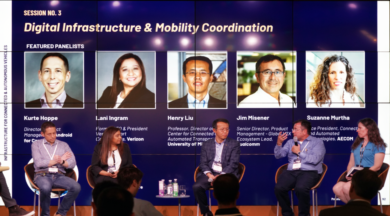
Digital infrastructure and mobility coordination panel
Panel, digital infrastructure & mobility coordination
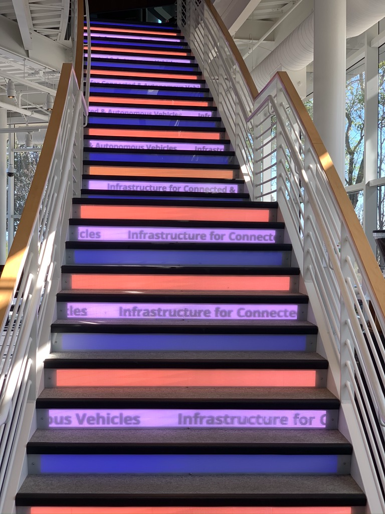
Environmental graphics running up the stair risers
Stair risers, animated
Alphabet Advanced Logistics Summit
Automated warehousing panel
Panel, automated, advanced warehousing
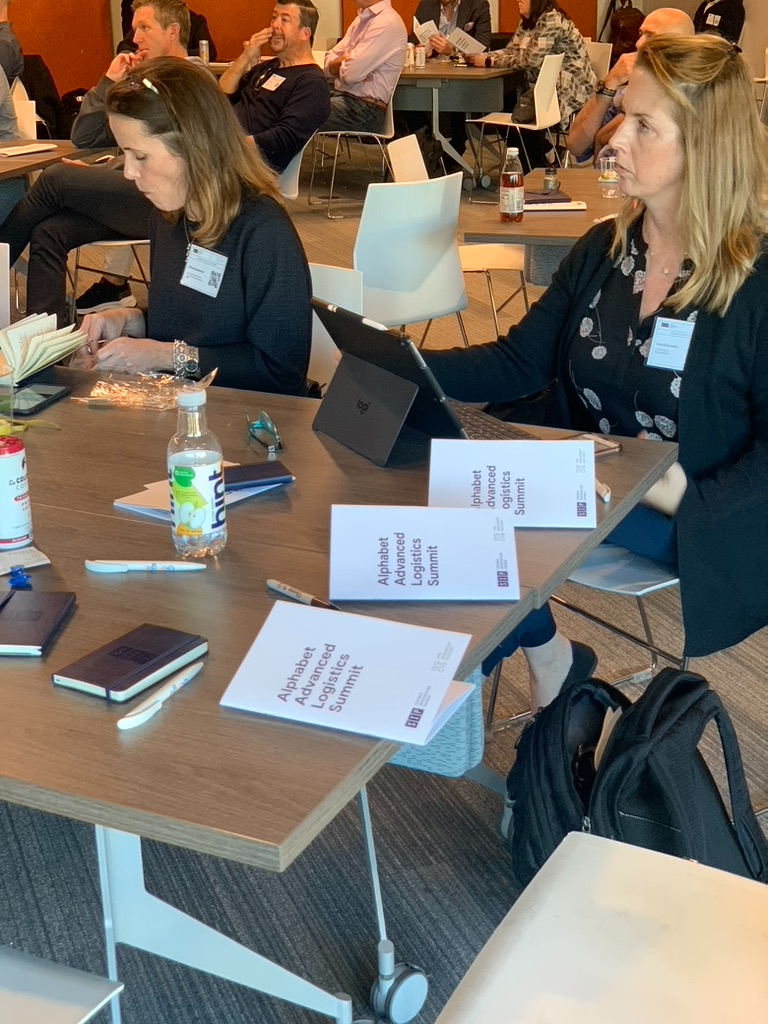
Printed programmes on the table
Printed programme, one per seat
$1.4B Raised across Alphabet, StepStone and Ontario Teachers' Pension Plan on the core narrative and LP materials.
1,000+ Decks, system diagrams, RFP responses and white papers, most of them made with the co-CEOs and nearly all confidential. Each brief technically complex; each deliverable legible to financial, civic and technical audiences at once.
$2.5M Brooklyn headquarters, directed end to end, a hospitality-forward space that embodied the firm's mission. Covered in Dezeen.
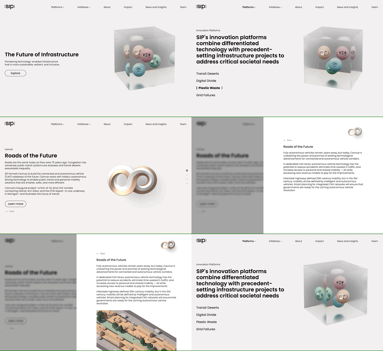
SIP website, the ecosystem cube turning
sidewalkinfra.com. The cube is the whole thesis in one object: five platforms suspended in a single system.
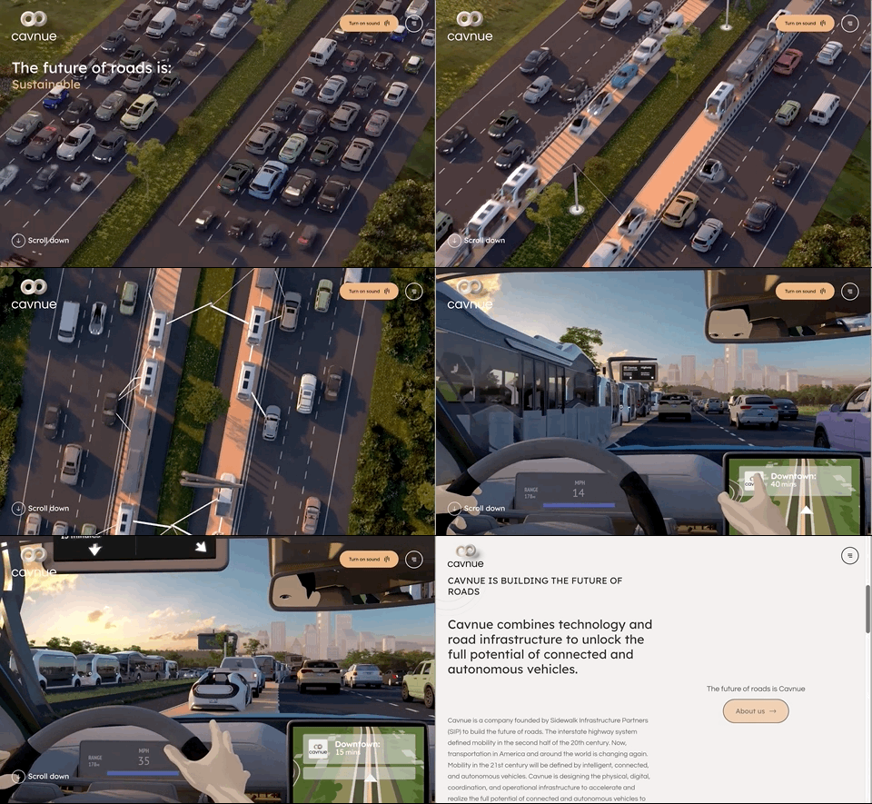
Cavnue website, scrolling
Cavnue.com, narrative, art direction and launch film. Watch the film
Innovative Infrastructure Initiative website
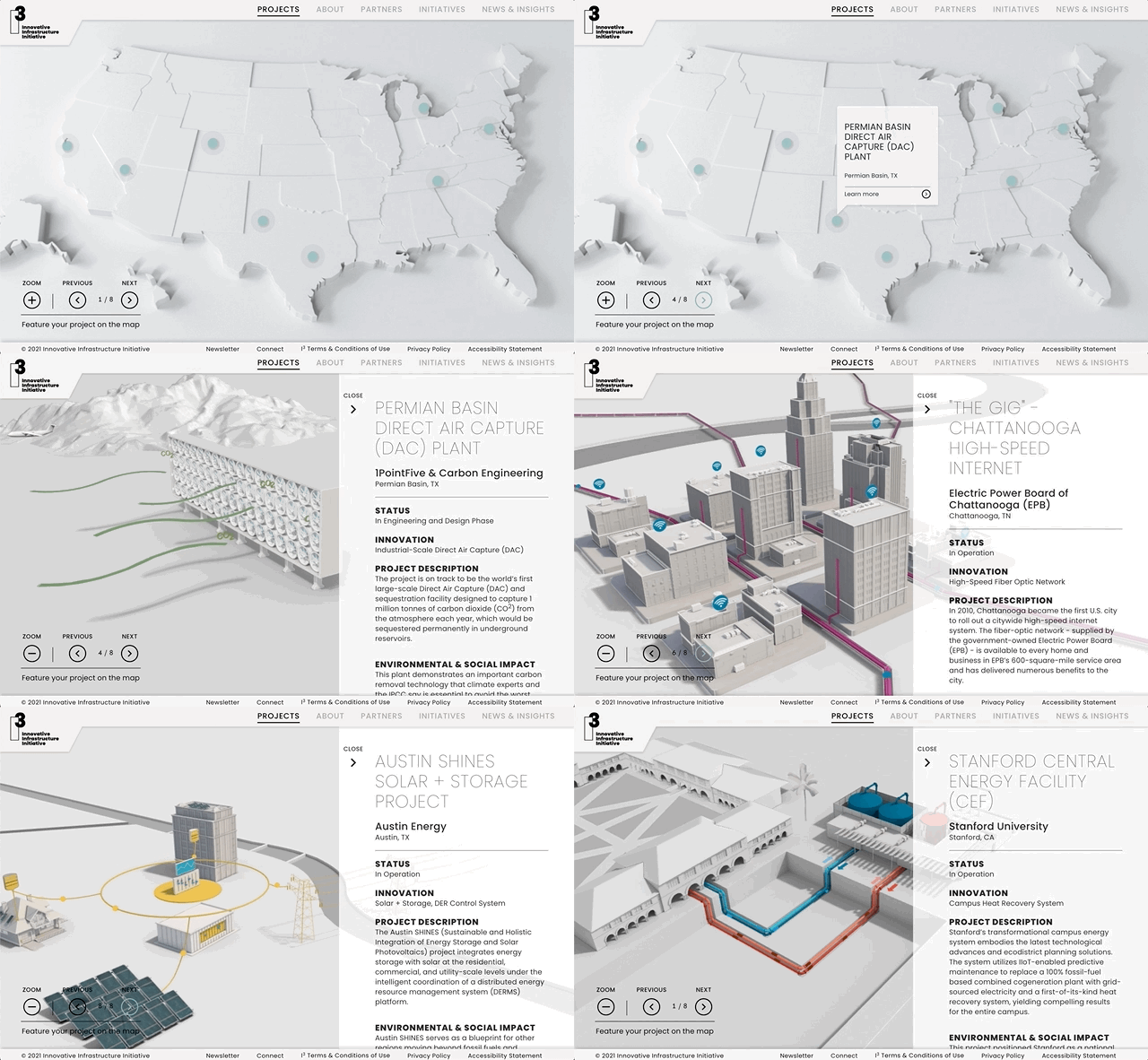
I³, the Innovative Infrastructure Initiative, SIP's public policy platform.
CoFi website landing animation
CoFi, Dense Air’s shared 5G platform. The mark builds as the page enters.
The film, and the platforms in motion
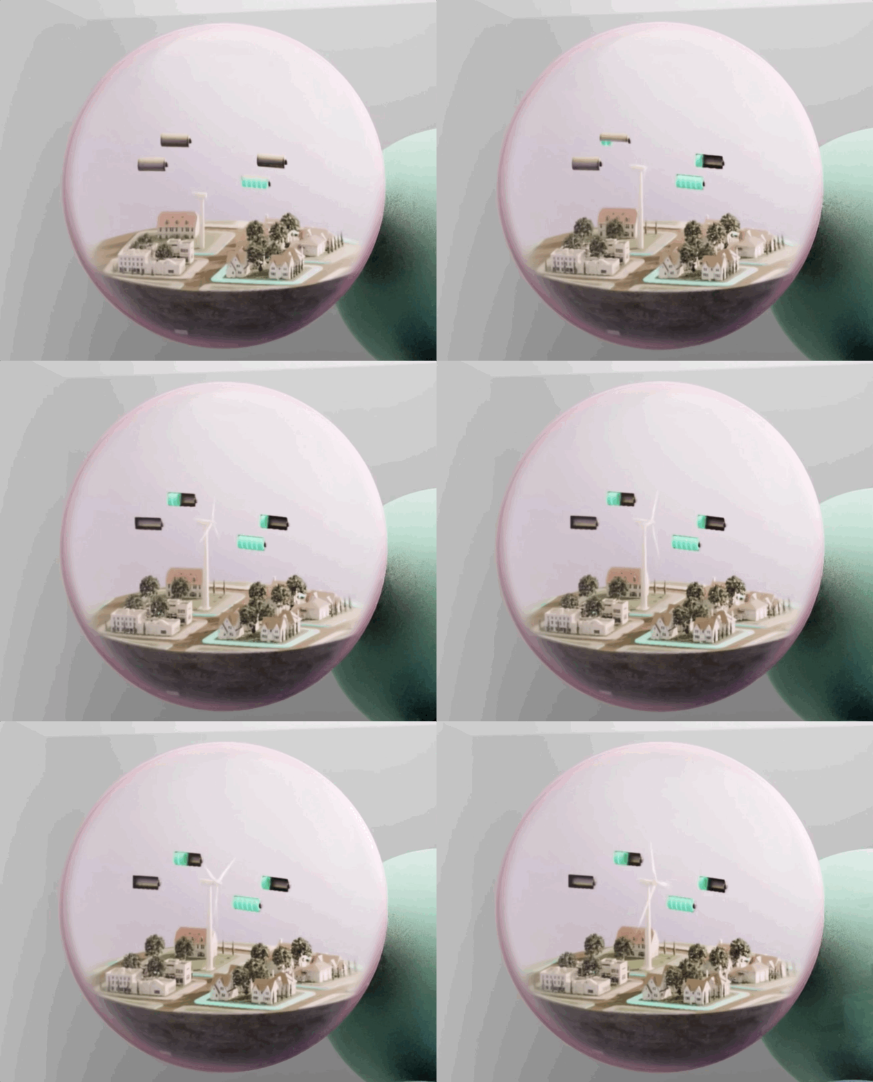
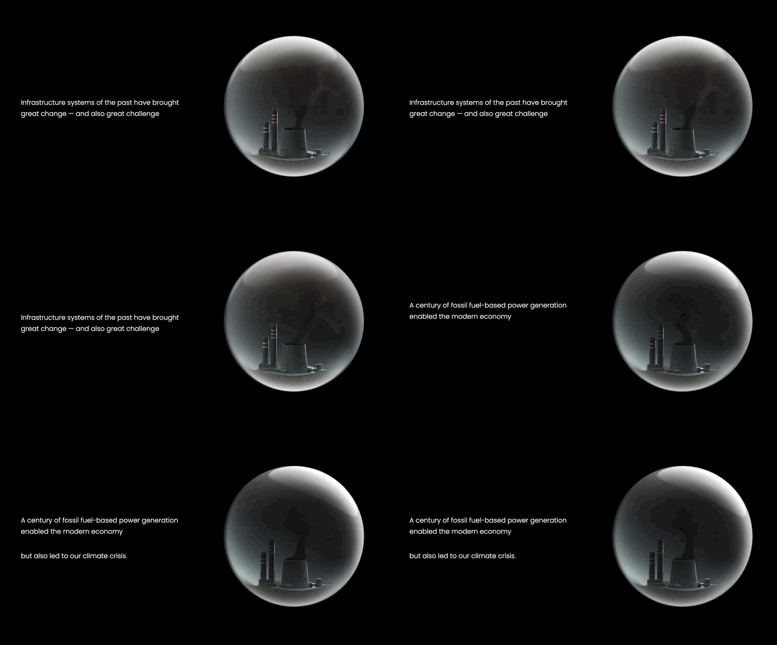
Scene 01The past, under glassRoads, wires and pipes are compressed into a single glass sphere, lit like a specimen. Infrastructure as something inherited and sealed.
Scene 02The problems namedThe sphere multiplies. Each one carries a failure — the digital divide, grid failure, transit deserts — sitting in the same frame at the same scale.
Scene 03Launch out of the parentThe SIP cube opens and the five marks are released as particles, each rotating into its own axis and finding its own material and colour.
Scene 04Observed togetherThe camera pulls back and all five are suspended in one volume, depth of field bringing whichever platform is being discussed into focus.
The platform film, in full
Infrastructure of the past, held in a glass sphere
Resilia: distributed storage, village scale
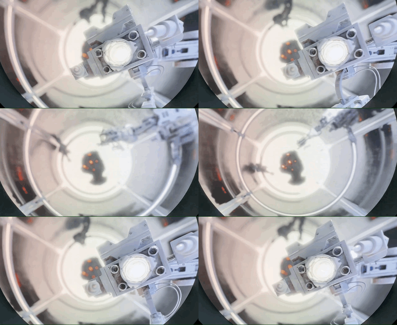
Polysift: robotic sortation, plastics recovered at line speed
The digital divide, one sphere among many
Press relationsPromoted to lead all press for 18 months

Established SIP as a national voice on resilient infrastructure with sustained coverage in Bloomberg, Forbes, Fortune and Fast Company, and launched a weekly newsletter covering market news and the firm's own thought leadership.

Bloomberg Forbes Fortune Fast Company Dezeen

{{ b.title }}

{{ b.note }}

{{ sp.t }}

{{ d.k }} {{ d.v }}
Behind the scenes Samples reviewed at a kitchen table 2,900 miles from the site, colours approved off photographs held against the brick, and a raw floor kept on schedule by video call.
{{ x.cap }}
{{ x.cap }}
{{ g.alt }}

The system

Colour, type and production standards set in-house, then held across four volumes and every piece of collateral around them.

Colour system, volume colours
{{ c.hex }} {{ c.role }}
Accents, illustration and diagram
{{ a.hex }} {{ a.role }}
Typography
{{ t.name }} Foundry {{ t.foundryName }} Use {{ t.use }} Description {{ t.desc }}
Production
{{ s.k }} {{ s.v }}
Design philosophy

I started with raw Google Docs spanning sustainability, housing, mobility, economics, policy and infrastructure. I read and coded the entire corpus, assigning each passage a visual form and a narrative weight. That hierarchy defined what needed to exist, how large it should be, and where it should live.

From there I wireframed every chapter so layout followed logic, not decoration, and built a visual taxonomy that ranked maps, charts, renderings, diagrams and illustrations by magnitude. Scale determined placement, spread behaviour and proximity to text, a consistent rhythm across four volumes and 1,524 pages.

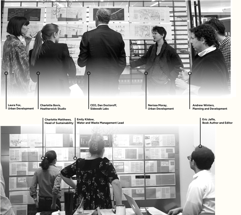
To execute at pace I interviewed twenty candidates and assembled a focused team: typographer, cartographer, generalist, architectural illustrator. Daily stand-ups, coordination with policy, engineering and product.

Chapter wireframes on the wall

Execution path

The operating sequence for turning an unstructured, multi-disciplinary corpus into a coherent publication.

I read and coded the full body of Google Docs across policy, engineering, urban design, sustainability and finance. Each passage was tagged with a required visual type and narrative weight, forming a content hierarchy tracker that dictated what got built and where it lived, so heterogeneous material could behave as a structured argument rather than a pile of documents.

Stage {{ stage.n }} {{ stage.title }}
{{ step.label }}
{{ p.quote }}
Colophon
{{ c.label }} {{ c.value }}
← All work

I've spent a decade making things feel inevitable before they exist.

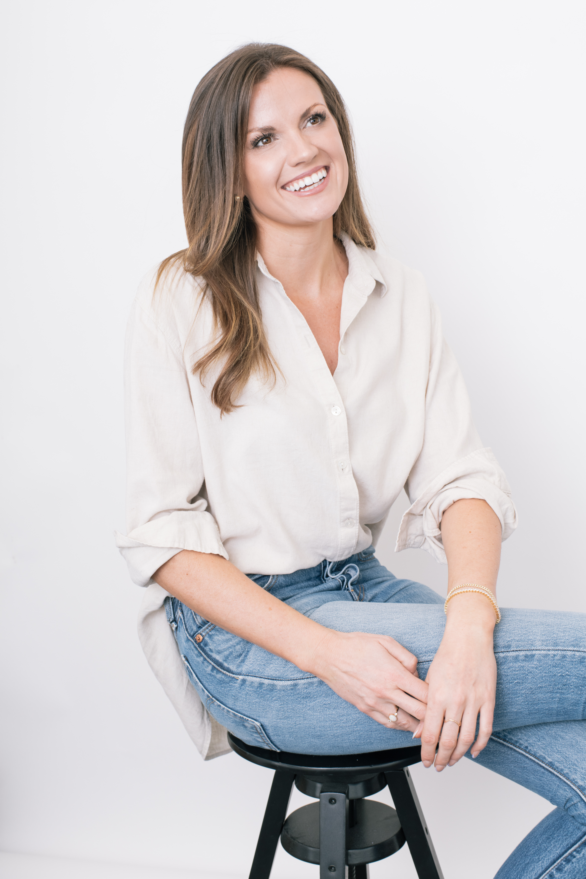
Leigh Whiting
Leigh Whiting
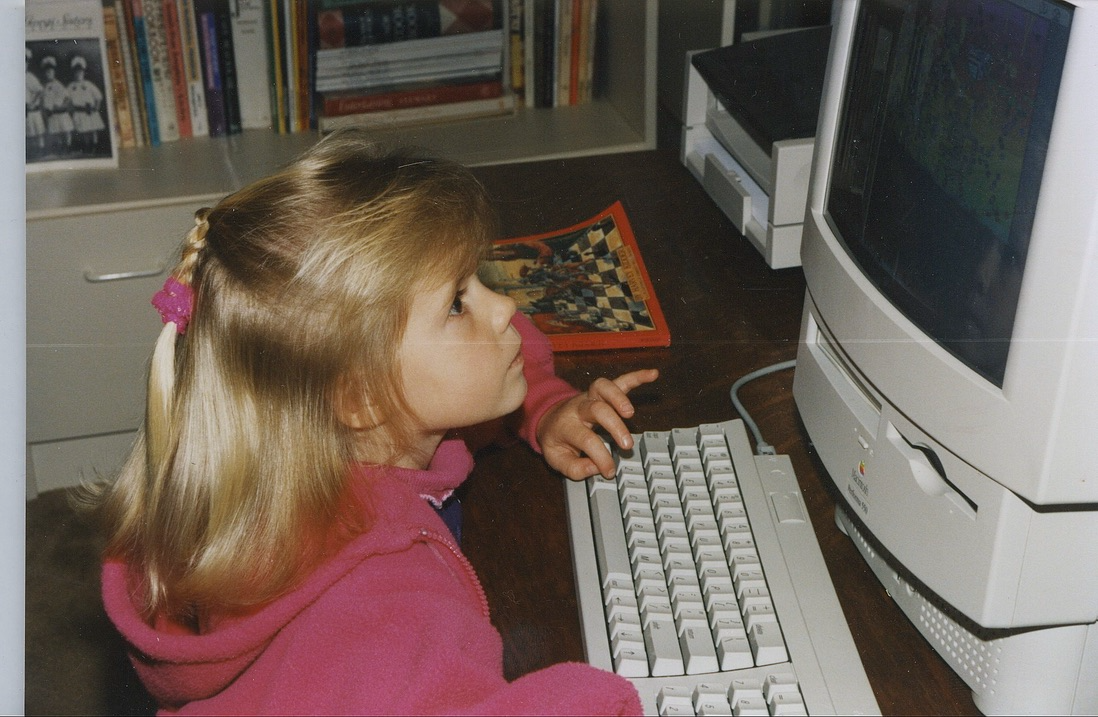
A small child at a Macintosh
First workstation, c. 1994

Design and strategy direction for high-stakes subjects, urban policy, engineering, infrastructure finance, deep technology.

Everything I do starts with learning the subject properly. Not a summary, the actual mechanics, deep enough to sit with the engineers and enjoy the detail. Curiosity is the method: read it, ask about it, build a version, test it, and let what you learn change the work. That's how a brand ends up feeling true rather than decorated.

I work closest with CEOs and co-founders, visionaries who can see the whole thing clearly but have no way to draw it. I become the extension of that vision: I take the half-formed idea out of their head, give it form, and hand it back sharper than they described it.

The measure of the work isn't only what shipped. It's whether the thinking behind it is clear enough for the next person to build on.

I work fractionally with early-stage companies that need a senior creative mind in the room without the full-time overhead. If you're building something that doesn't exist yet and it needs to feel real, to investors, to press, to the public, let's talk.

DisciplinesBrand strategy & positioning
Visual identity & systems
Complex publication design
Narrative & investor materials
CollaboratorsPentagram
Heatherwick Studio
Snøhetta
Beyer Blinder Belle
Squint/Opera
Kilograph • Try Studios
RecognitionTIME Best Invention, Cavnue
Harvard teaching reference
Dezeen • Fonts In Use
The Dieline
How I work

Four things I hold to, whatever the project is.

{{ pc.kicker }} {{ pc.phrase }} {{ pc.body }}

Curriculum vitae

Download PDF
Experience
2022–Present
Fractional Design Director, STUDIO•USEmbedded design and brand leadership for ventures in infrastructure, sustainability and deep technology. Interim Creative Director for Upgraid, FoundationAI and Catalyst Housing Group. A five-week AI-native sprint for Upgraid delivered brand, website and positioning supporting $44M in competitive wins and 80% faster sales cycles.
2019–2022
Design Director & PR Director, Sidewalk Infrastructure PartnersFirst and only creative hire for an Alphabet-backed venture. Built the narrative and LP materials behind a $1.4B raise from Alphabet, StepStone and Ontario Teachers' Pension Plan; branded five portfolio companies; led press for 18 months; directed the $2.5M Brooklyn headquarters.
2020–2022
Founding Design Director, CavnueSole designer on the three-person team that won the Michigan DOT RFP for the first automated vehicle corridor, then built the brand. Named a TIME Best Invention.
2018–2019
Design Lead, Sidewalk Labs • GoogleInternal design direction and leadership on Toronto Tomorrow, the four-volume Master Innovation and Development Plan for the city of Toronto.

Modes of practice

Three ways in

Same standard of work, three ways to buy it.

{{ mc.label }} {{ mc.title }} {{ mc.body }} {{ mc.meta }}

Press

Selected coverage / 2019–2024

Ask me about…

Two, and then we’re even
Following my grandmother’s diaries across post-war Europe She helped rebuild Vienna after the war. I read each entry standing where she wrote it, in order.

{{ arcIntro }}

{{ arcLabel }}
{{ arcMeta }} {{ arcLabel }} {{ arcNote }}
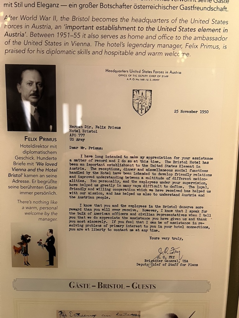
The Bristol, still keeping the 1950 letter to Felix Primus on the wall
The Bristol, still keeping the 1950 letter to Felix Primus on the wallVienna
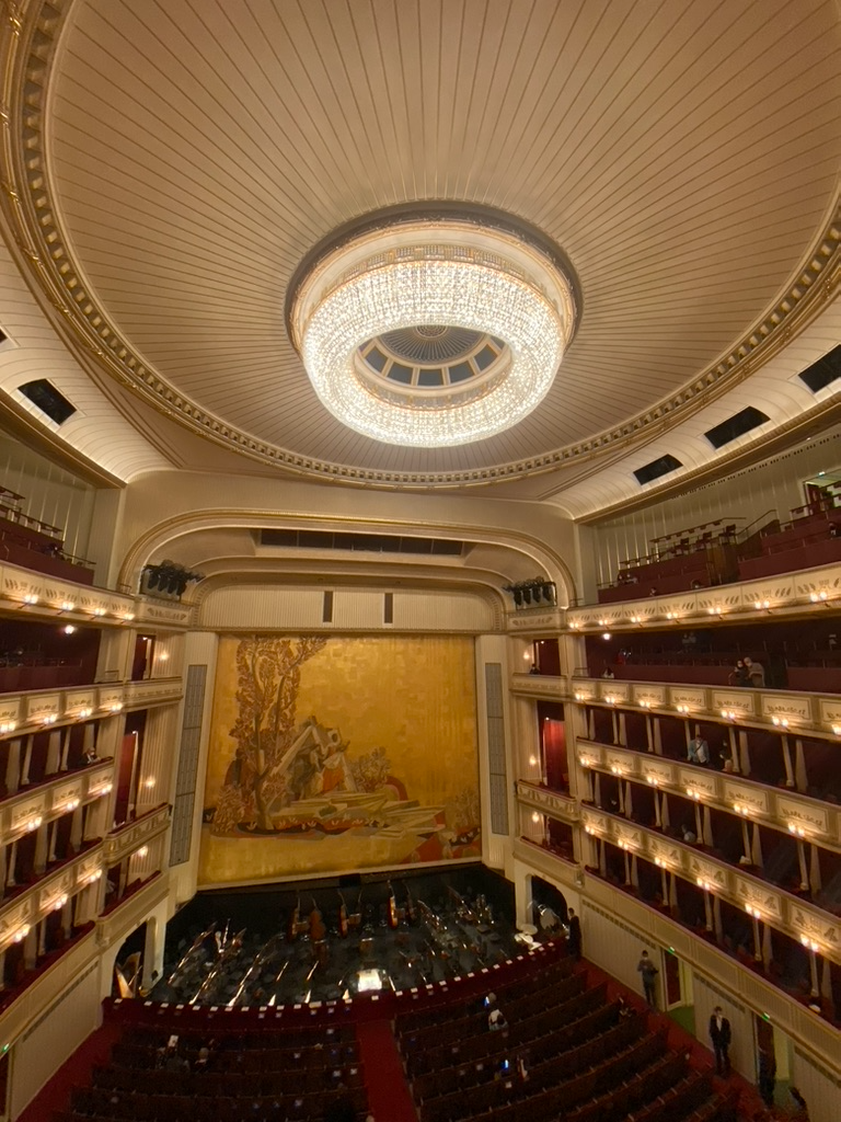
The Staatsoper from the upper circle
The Staatsoper from the upper circleVienna
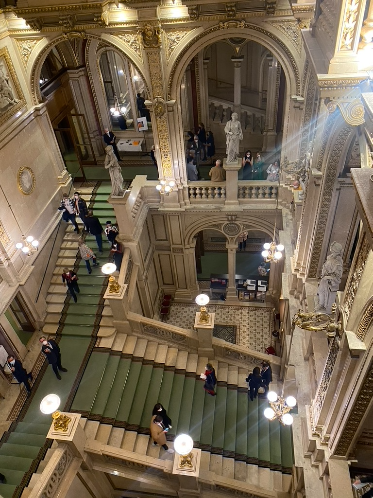
The Vienna Opera House, where she often went with friends or on dates
The Vienna Opera House, where she often went with friends or on datesVienna
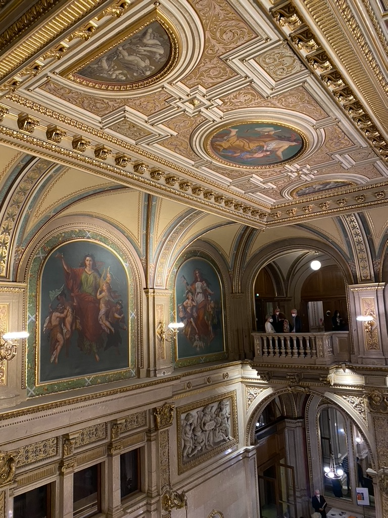
Gilt and painted panels above the landing
Gilt and painted panels above the landingVienna
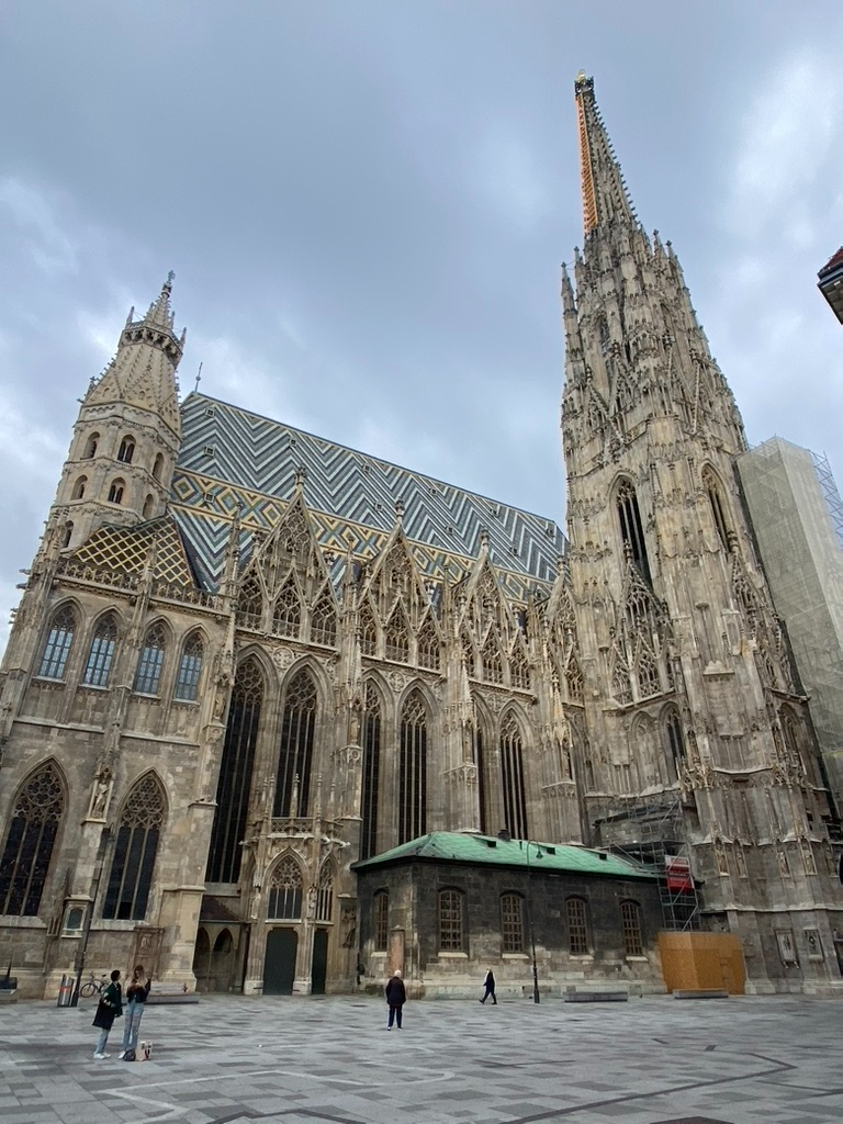
Stephansdom, the roof rebuilt after the war she was writing through
Stephansdom, the roof rebuilt after the war she was writing throughVienna
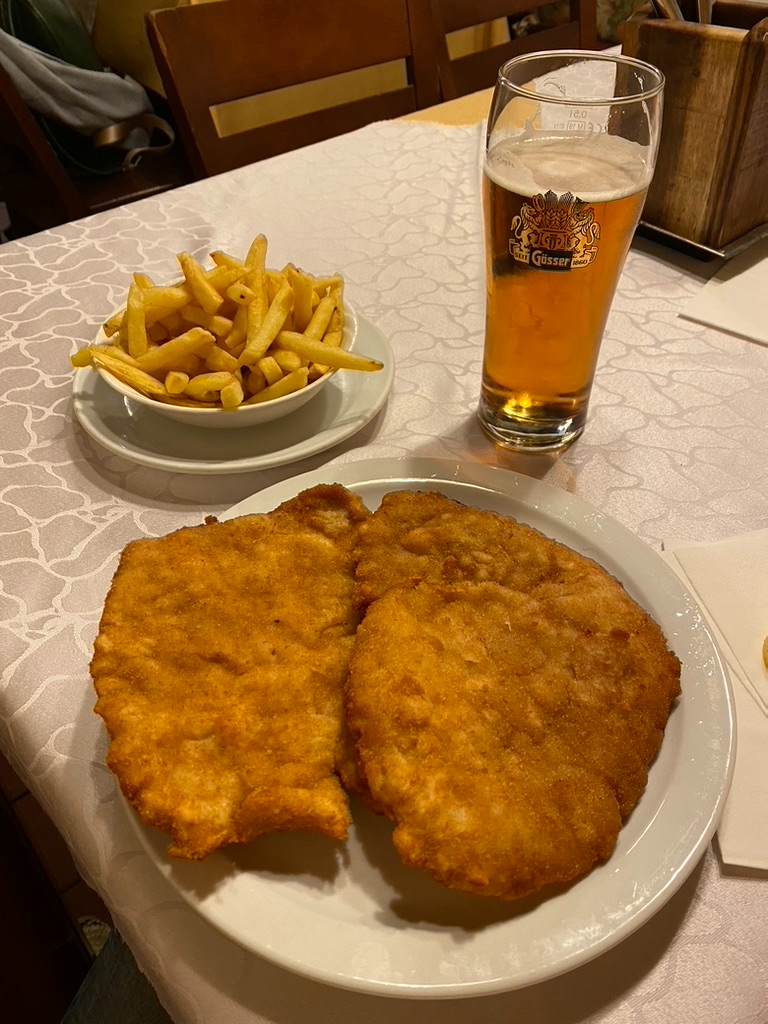
Schnitzel and a Gösser
Schnitzel and a GösserVienna
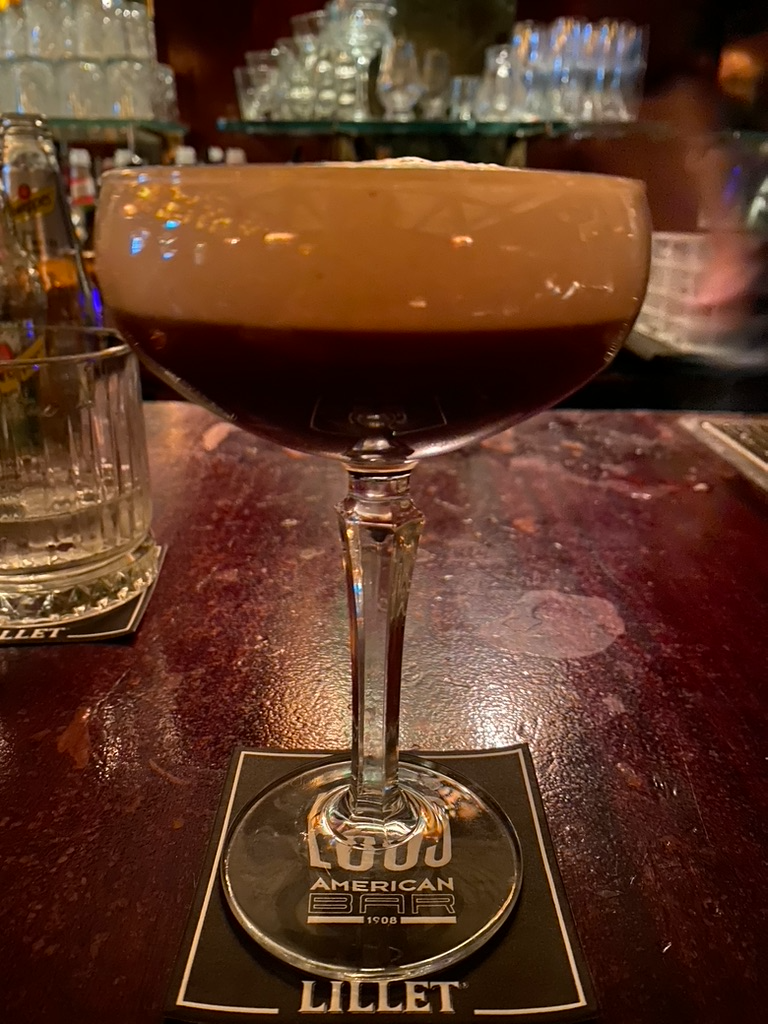
Loos’ American Bar, 1908 and unchanged
Loos’ American Bar, 1908 and unchangedVienna
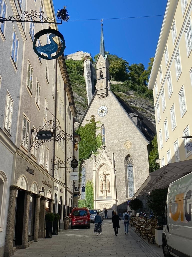
Getreidegasse, on the way south
Getreidegasse, on the way southSalzburg
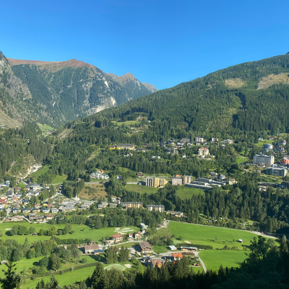
The valley from above, the spa town stacked up the slope
The valley from above, the spa town stacked up the slopeBad Gastein
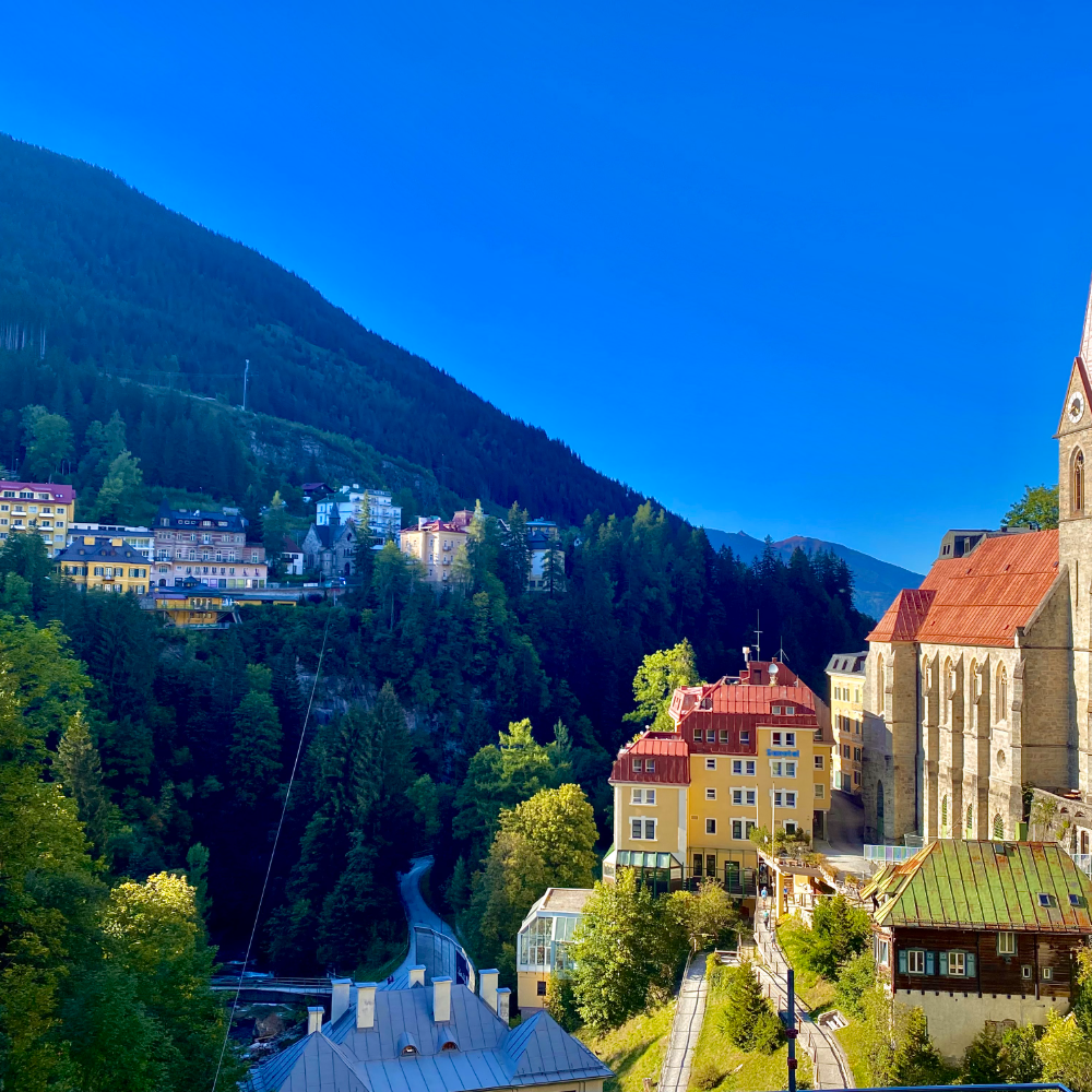
Nikolauskirche and the funicular line down the gorge
Nikolauskirche and the funicular line down the gorgeBad Gastein
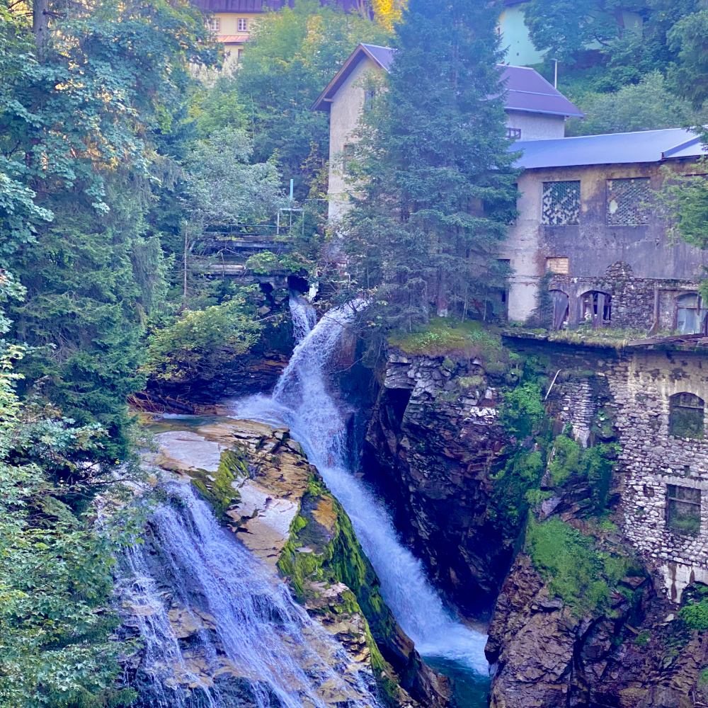
The Gasteiner Ache falling through the middle of town
The Gasteiner Ache falling through the middle of townBad Gastein
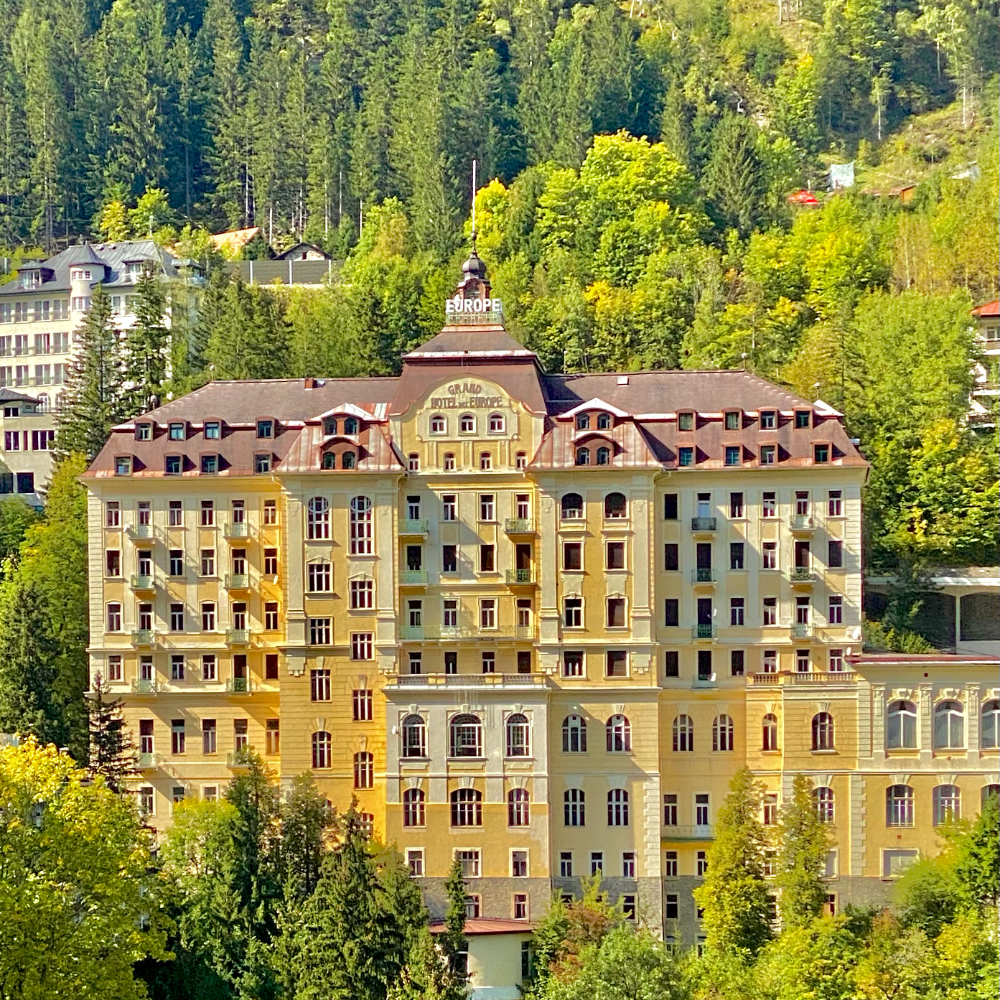
Grand Hotel de l’Europe, empty since the cure years
Grand Hotel de l’Europe, empty since the cure yearsBad Gastein
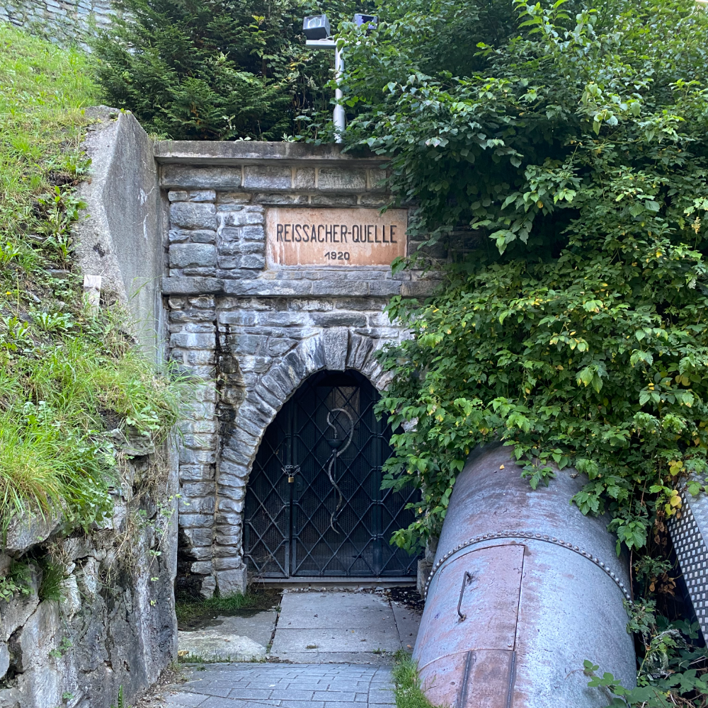
Reissacher-Quelle, 1920, one of the thermal springs
Reissacher-Quelle, 1920, one of the thermal springsBad Gastein
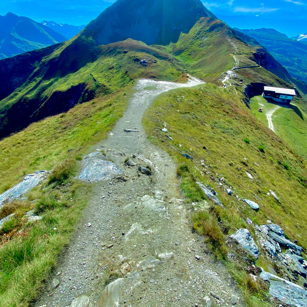
The ridge trail up the Stubnerkogel
The ridge trail up the StubnerkogelBad Gastein
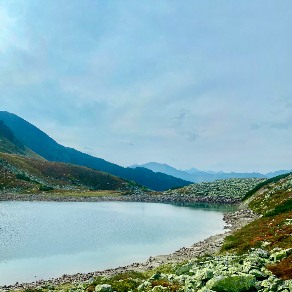
A tarn below the ridge, the water still cold in September
A tarn below the ridge, the water still cold in SeptemberBad Gastein
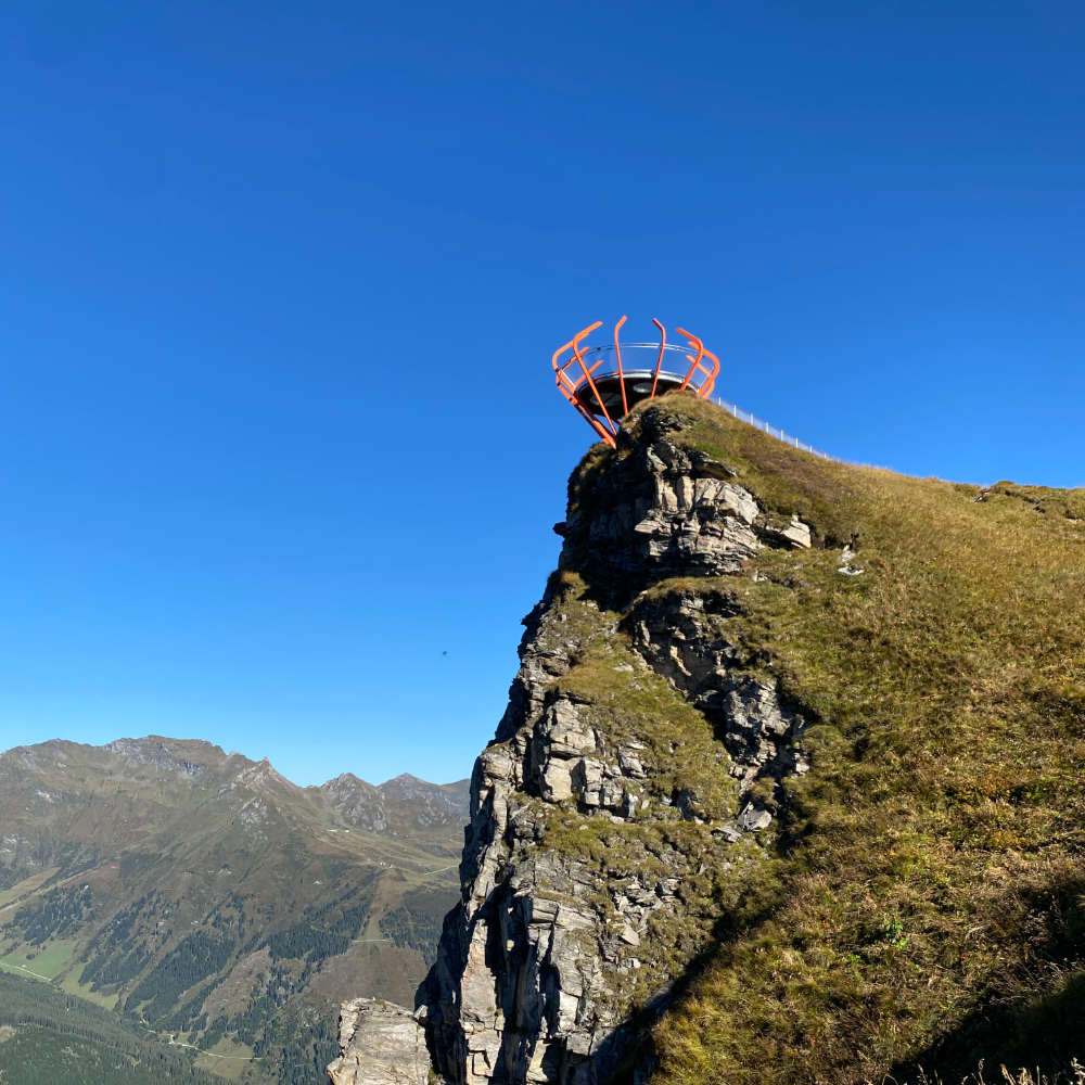
The viewing platform cantilevered off the rock
The viewing platform cantilevered off the rockBad Gastein
A Märzen and a Verlängerter on the way down
A Märzen and a Verlängerter on the way downBad Gastein
Rupertikirtag, dirndls and Trumer Pils
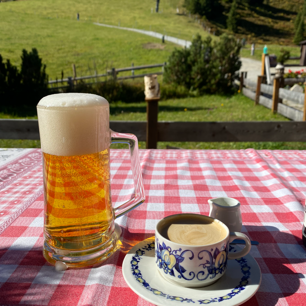
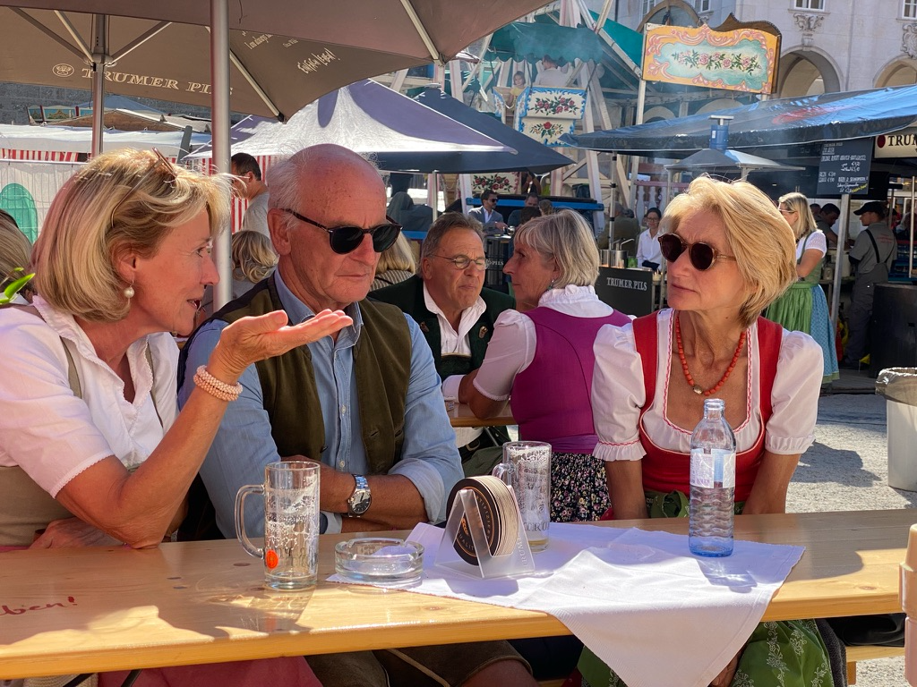
Rupertikirtag, dirndls and Trumer PilsSalzburg
The logistics of travelling with a dog across borders Penny has cleared more customs desks than most people. Nineteen stops, nine countries, and a folder of paperwork for each one.
Where she has been Seventeen stops · hover a marker

Playground

Unbriefed, unfinished, unclient-ed. Things I make to stay sharp, type drawing, print tests, tooling, the occasional map. Some of it becomes method later.

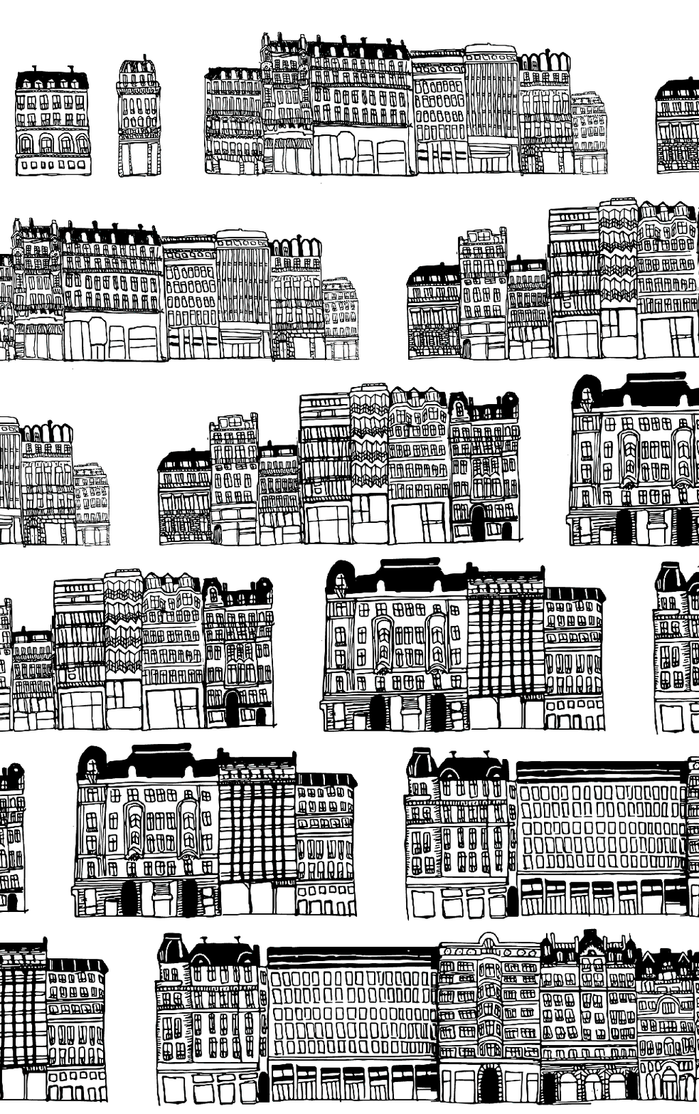
Hand-drawn elevation of the Champs-Élysées
Champs-Élysées, drawn by hand 07.26
Continuous street elevation, ink on paper, one building at a time
Hyperlocal In progress
Neighbourhood-scale product, identity and interface
FitnessFriend In progress
Companion app, product design and motion
Wayfinder, stretched 07.26
Variable-width display drawing
Prompt-to-layout tests 06.26
Where the machine helps, where it does not
Twelve columns, broken 05.26
Editorial rhythm without a client
Extruded marks 04.26
Identity in three dimensions
Two-colour proofs 03.26
Overprint, misregistration, on purpose
Hand-drawn transit maps 02.26
Old habit from the Toronto years
Bottle labels, no brief 01.26
Fermentation, again
Loops 12.25
Twelve frames, no client

Drop your own files onto any well, captions and dates are editable in place.

The next idea worth building deserves a story worth telling.

leigh@studiouscreative.com

If you're building something that doesn't exist yet and need it to feel real, to investors, to press, to the public, let's talk.

Telephone+44 7429 746690
+1 707 479 9647
Based London{{ clockLondon }} New York{{ clockNewYork }} San Francisco{{ clockSanFrancisco }}